
j

Lorem ipsum dolor amet, consect adipiscing elit, diam nonummy.

Follow Us

Search

Analytics Hub

Revamping a Data Analytics Application for Clarity

Summary

Context

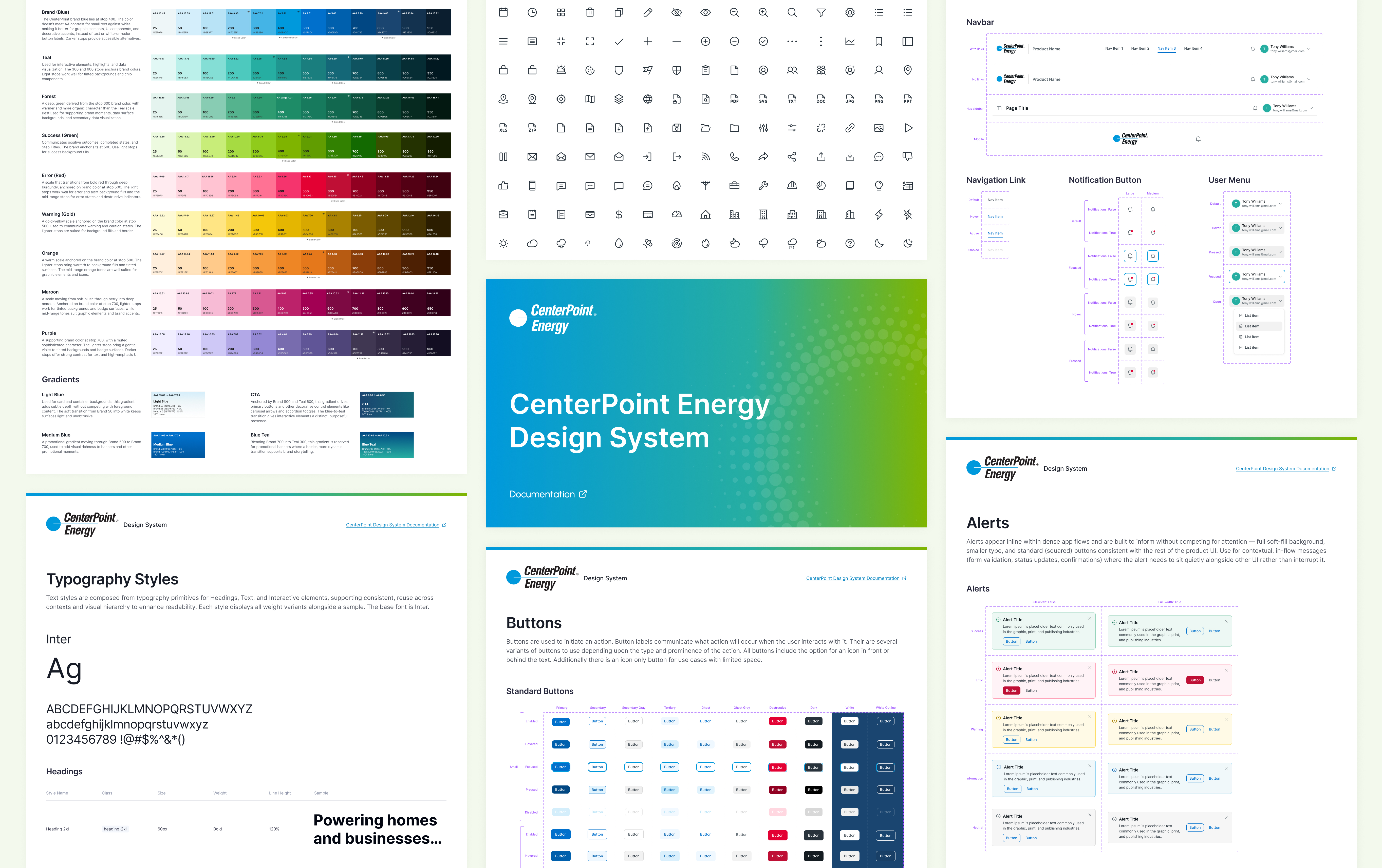
Analytics Hub is an internal supply chain application that gives leadership visibility into procurement and contract data. It needed a redesign to improve data visualization and filtering, and to be rebuilt using a design system I created for another product, Volt Design System. Because Analytics Hub would eventually integrate with other products already using the Volt Design system, building it with that system meant the two would feel cohesive and reduced design and development work.

The redesign had two constraints: colors and patterns had to adhere to the design system, and I couldn’t make major changes to the application’s existing layout or structure.

Note: All data shown is fictional for confidentiality.
My Role

I audited the existing application and redesigned it, improving the data visualization and clarity. I used as much of the design system’s existing component library as possible and built a product-specific component library for anything it didn’t cover. I conducted stakeholder interviews to inform the redesign, and worked alongside a PM on scope and business case and a developer on implementation.

The Problem

The application’s previous design made the data harder to depict:

  • Color was applied randomly, which created confusion about what color was supposed to mean rather than helping users read the data
  • Icons were vague and didn’t communicate the section they belonged to
  • Data shown against selected filters was unclear: it wasn’t obvious what was being filtered or how
  • Filtering took up too much of the screen and didn’t support bulk filtering, making it tedious to narrow down data
  • The side nav didn’t match the rest of the product, an unreplicated and off color made it feel disconnected, and each section had two redundant titles
  • Tables were squished horizontally, with no styling to distinguish data or status
  • Labels lacked clarity, leaving what some stats meant open to interpretation
  • No badges or color coding existed to communicate data status at a glance
  • Page and section titles lacked hierarchy, making it harder to distinguish what belonged to what

The Fixes

I made several edits across the application to improve data clarity:

  • I used colors meaningful to signify status, health, and risk.
  • I redid the icons so each icon corresponded to the content in the section.
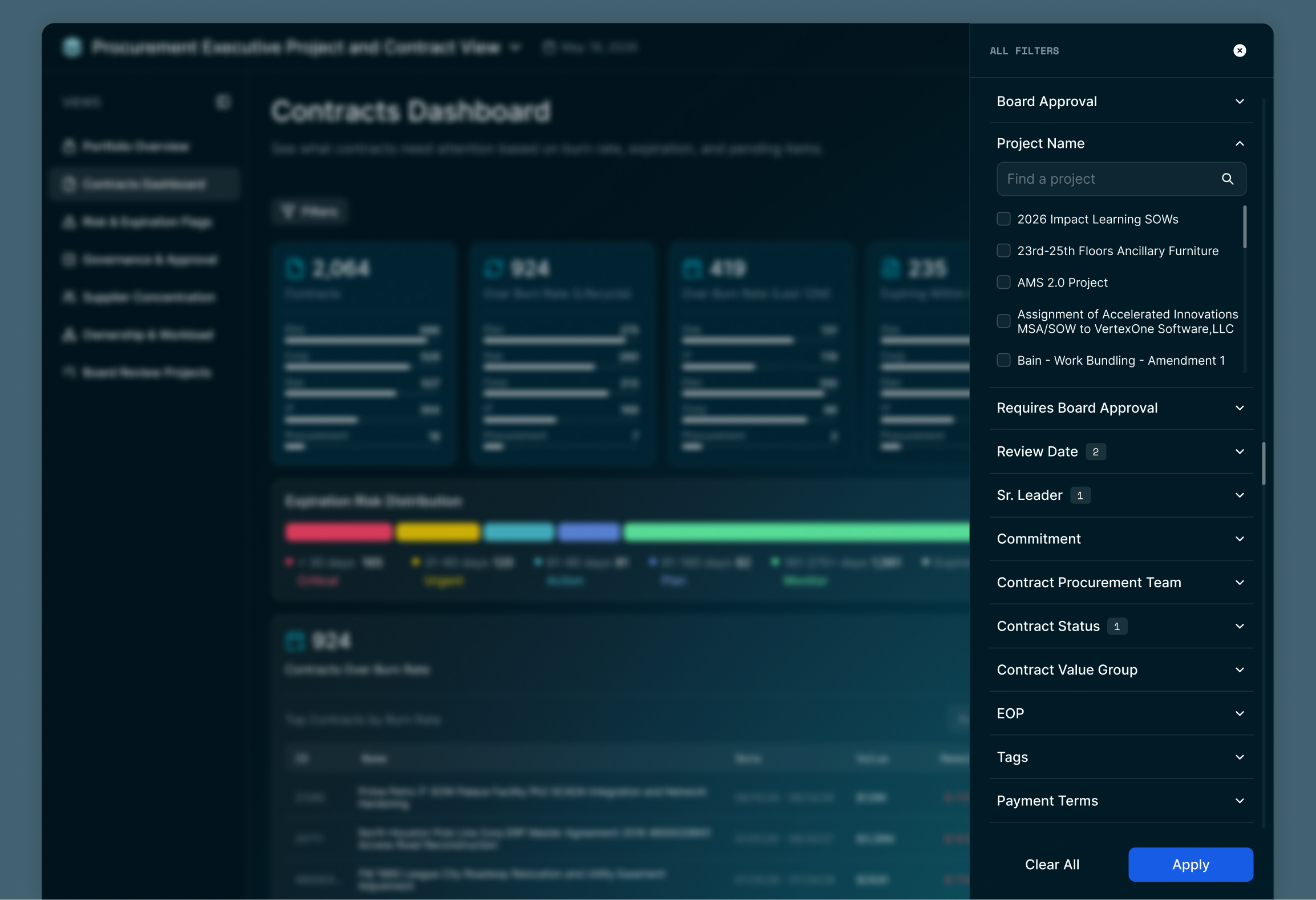
  • I restructured filtering with a drawer, added bulk filtering, and surfaced active filters as removable pills with a count badge next to the filters button so users could see and adjust what was applied without reopening the panel.
  • I rewrote labels and data across the app to provide clarity and remove guesswork.
  • I widened tables to full width and restyled them with badges and status color so data and health were distinguishable with a scan.
  • I restructured the layout of widgets to suit the content.
  • I rebuilt the side nav to use the system’s color palette and collapsed each section’s redundant double title into one.
  • I designed a logo for the application.

Page Highlights

Executive Daily Report

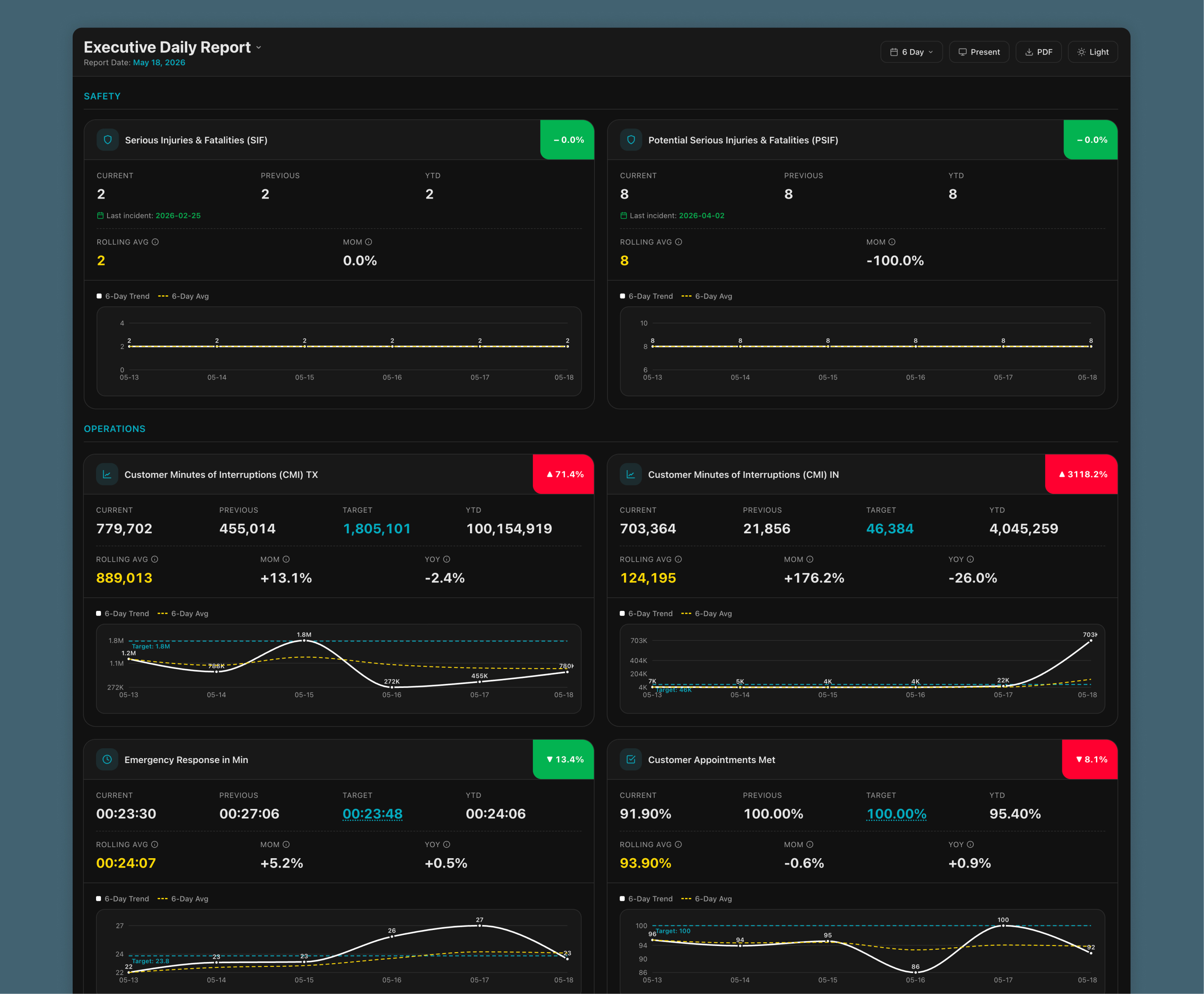
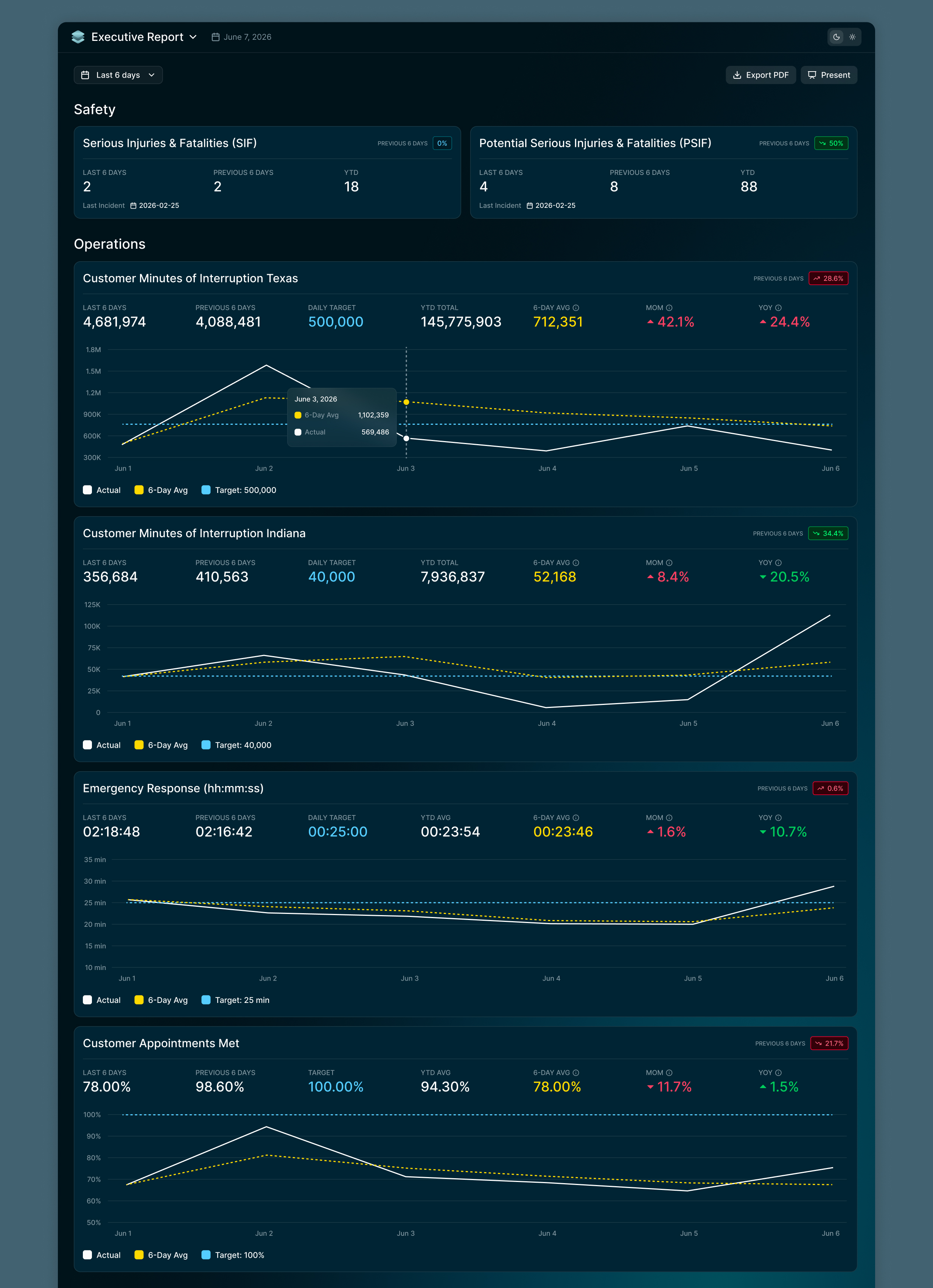
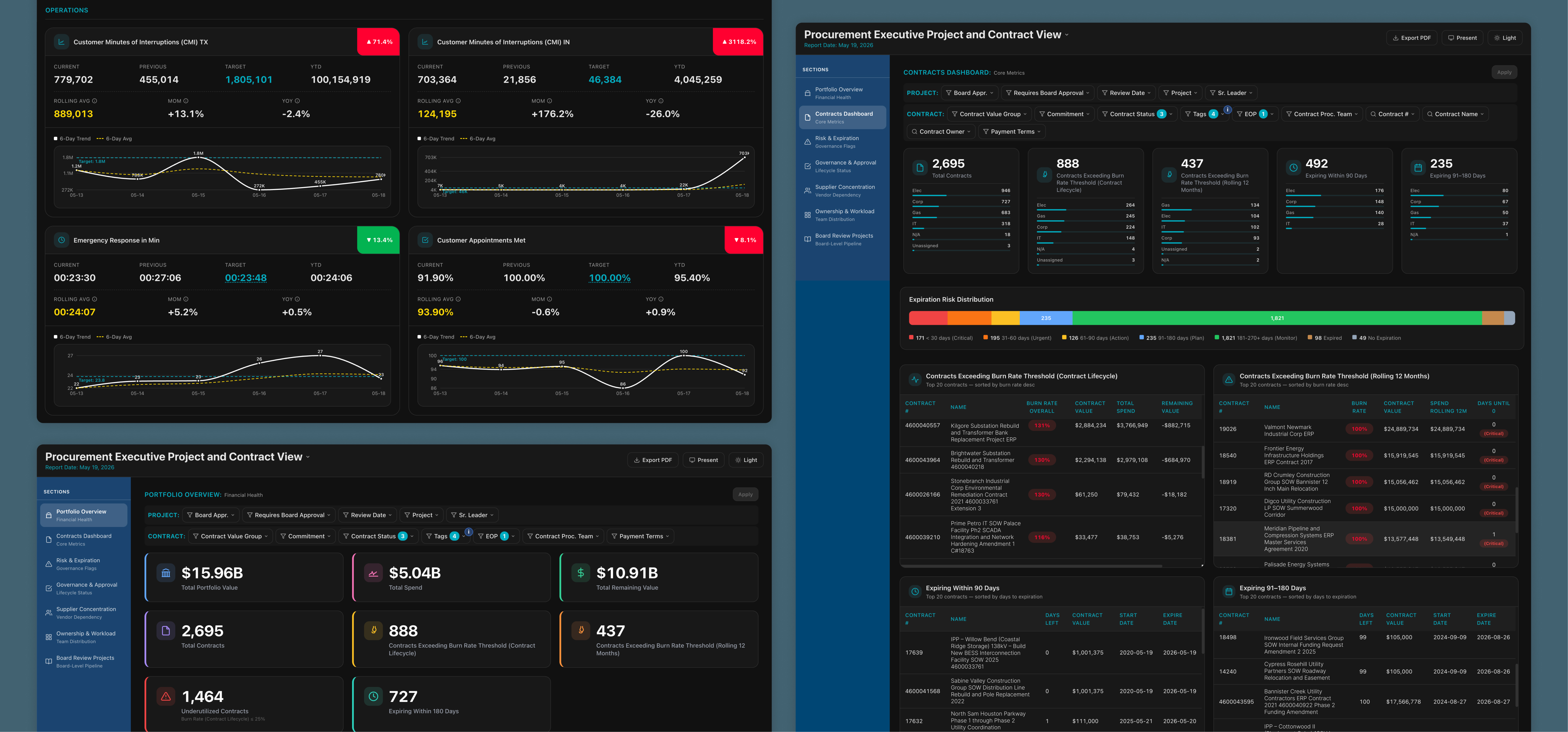
Labels like Current, Previous, Target, and Rolling Average didn’t specify their time range, so I added the range directly into each label (e.g., “Previous 6 Days” instead of “Previous”). The corner percentages didn’t state what they were compared against and the design was overly stark, so I added clarifying labels and toned down their visual weight. Stats didn’t update with the date filter only the graphs did, causing confusion and possible misinterpretation so I made every stat respond to the filter. Graphs and month-over-month stats were shown even on widgets like Serious Injuries and Fatalities, where that level of detail wasn’t valuable, so I removed them from those widgets. Widgets were narrow and graphs were small, so I widened the widgets and increased graph height to better show trend variation. The icons by the widget headings felt forced and tonally off on the safety-related widgets, so I removed them. I made the section headers bigger so it’s more clear they are headings and to better separate the sections for safety and operations.

BEFORE

AFTER

Portfolio Overview

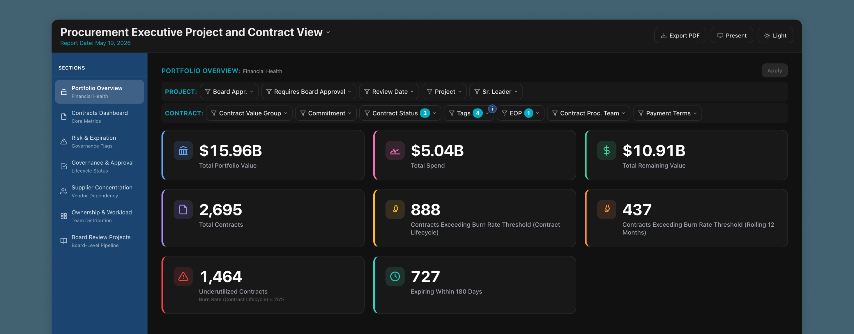
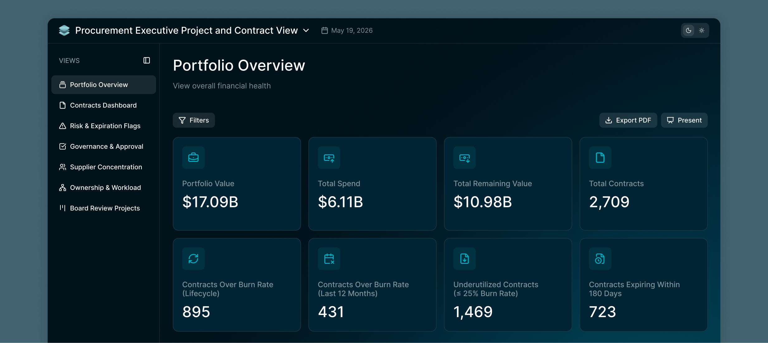
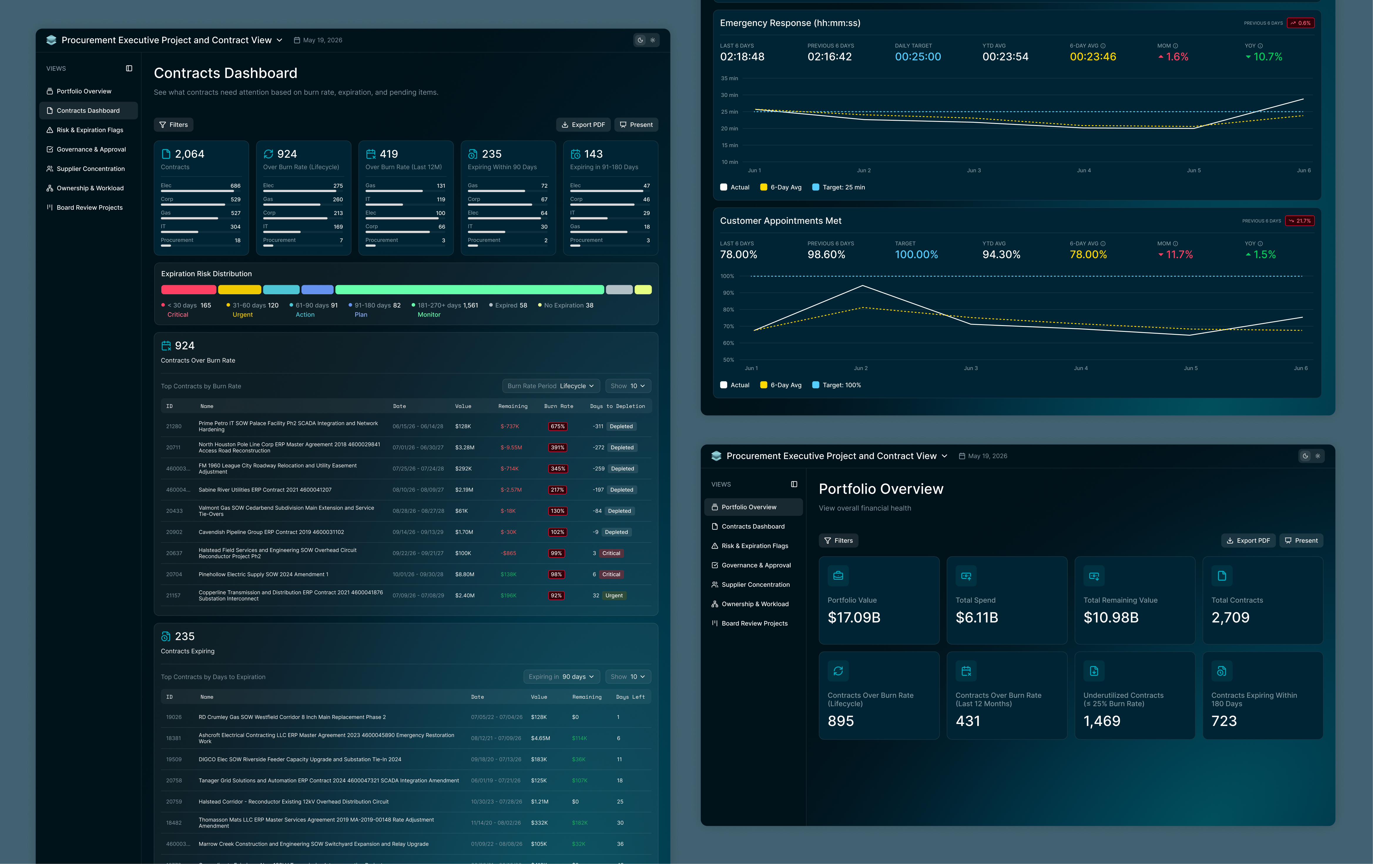
The portfolio overview screen used colors randomly without meaning, which caused more confusion. I made all the colors the same to give every stat the same level of hierarchy. The icons didn’t represent the sections they belonged to, so I revised them to better represent their corresponding stats. The layout wasn’t built for the static number of cards displayed, so I restructured it into an even 4×4 grid. Some stat labels lacked clarity, so I rewrote them to be more clear.

BEFORE

AFTER

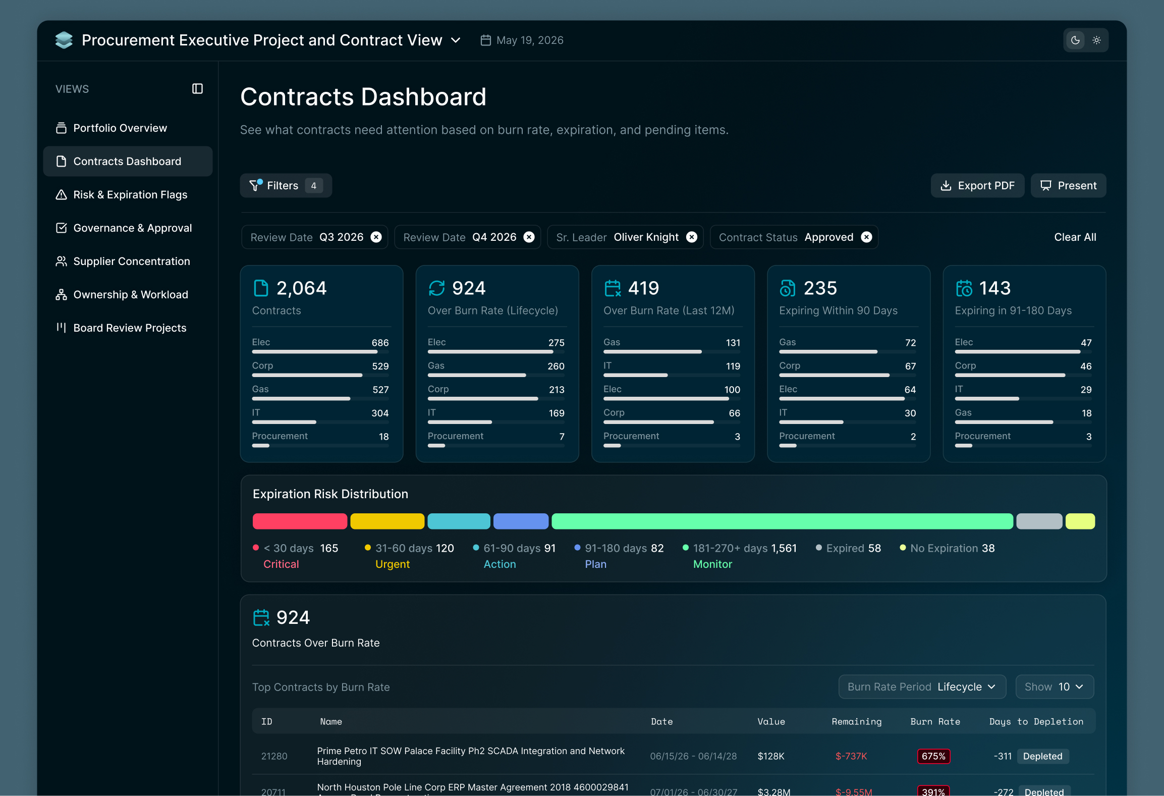
Contracts Dashboard

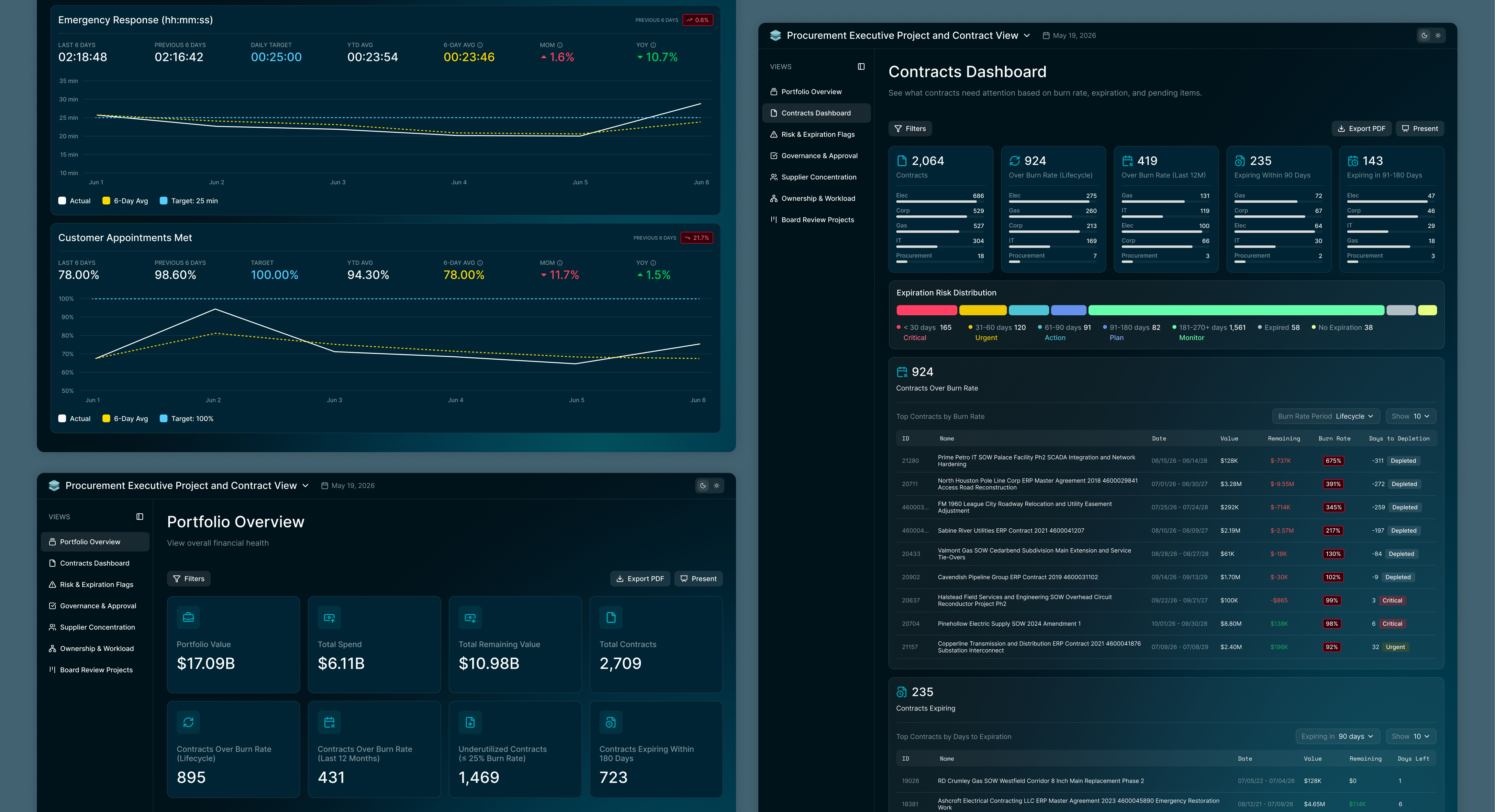
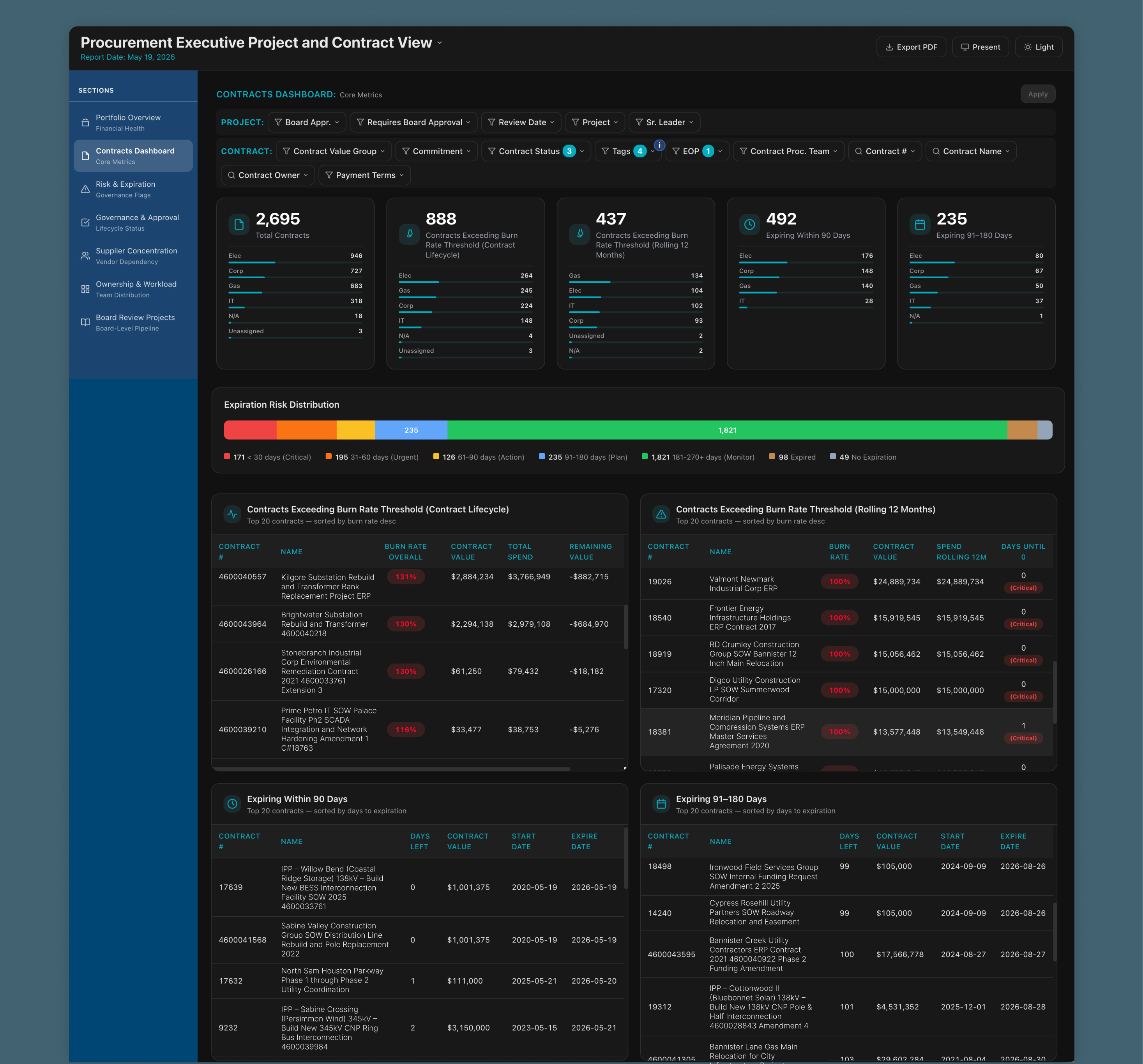
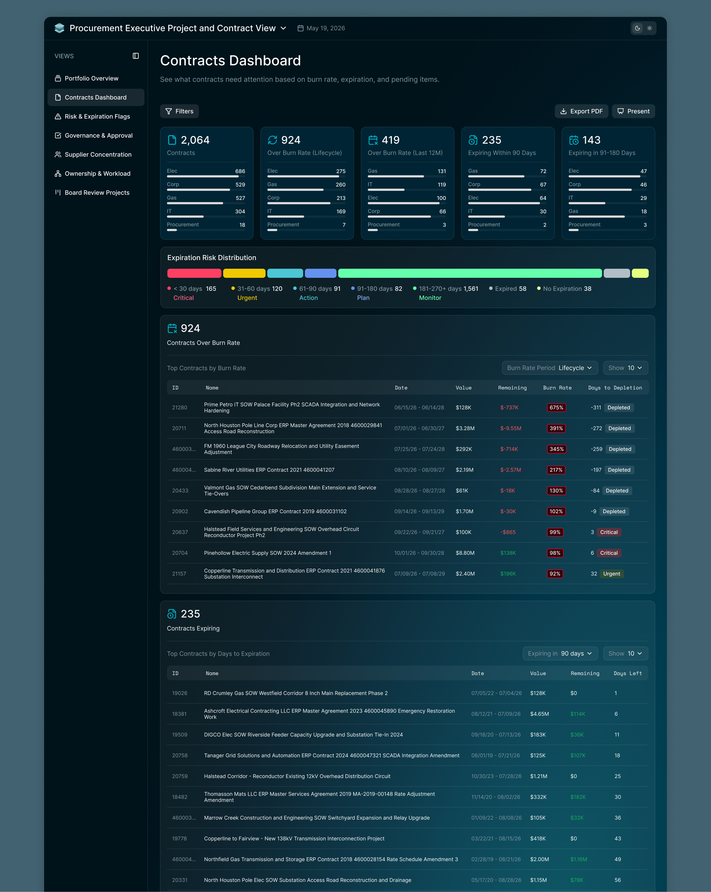
The Expiration Risk Distribution graph used heavily saturated colors that clashed with the rest of the product’s colors and had no consistent theming, so I rebuilt it using the design system’s palette, and to suit the meaning of the data. Tables were squished horizontally, so I expanded them to full width. I combined the burn rate tables and added filters for the different types of burn rates and the ability to change the amount of results shown per table to condense the data shown at once. Labels like Spend Rolling 12M and Days Until 0 were unclear, so I rewrote them for clarity. Icons didn’t correspond to their card content, so I updated them to match.

BEFORE

AFTER

Filtering

The previous filter UI presented two full rows of dropdowns competing for attention before the user ever saw the data, so I moved filtering into a drawer that stays out of the way until needed, giving users faster time to insight. I added a count badge on the Filters button and removable pills showing active filters, so users can see and adjust what’s applied without reopening the drawer. When the removable pills extended past the width of one row, arrows appeared to navigate back and forth through a carousel of all the active filters.

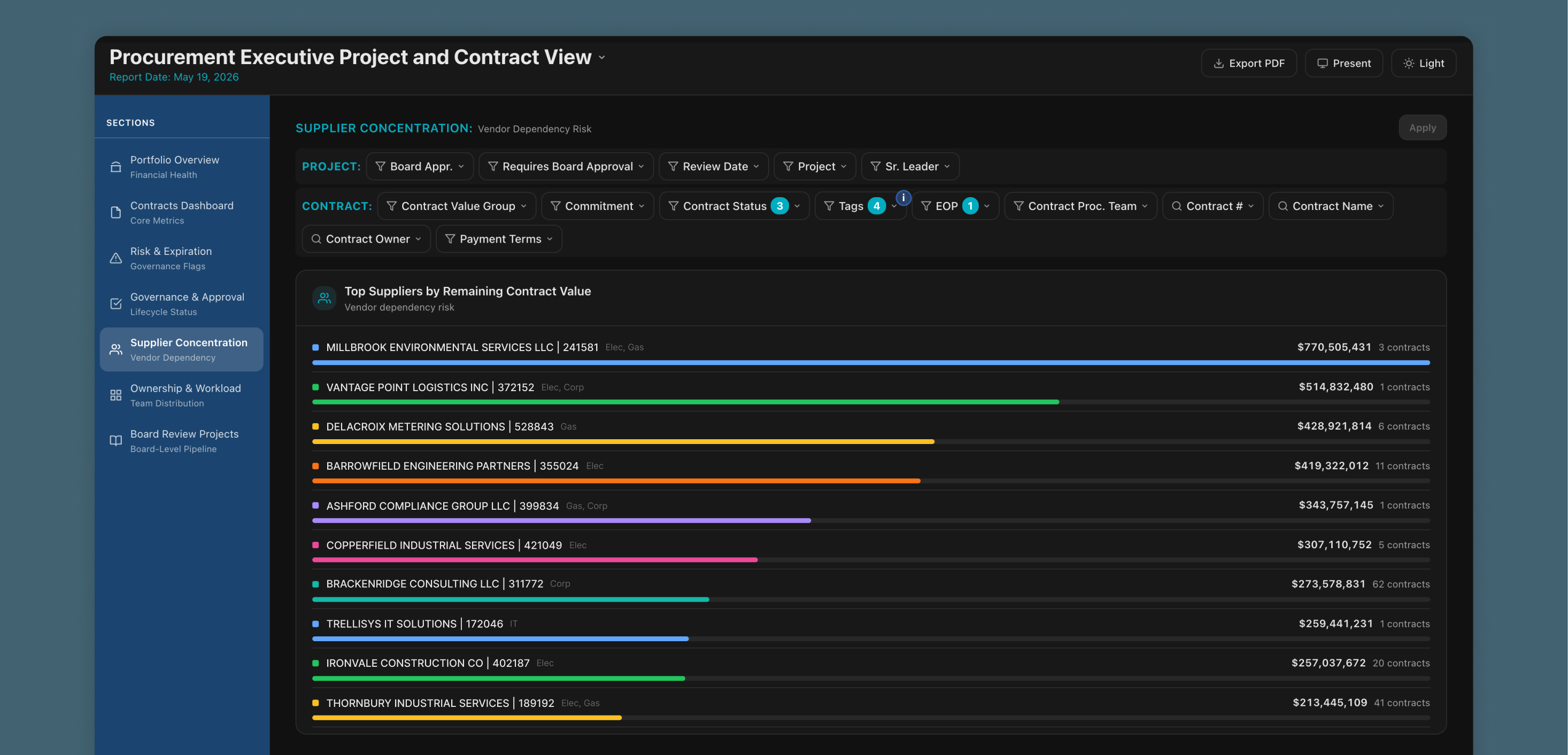
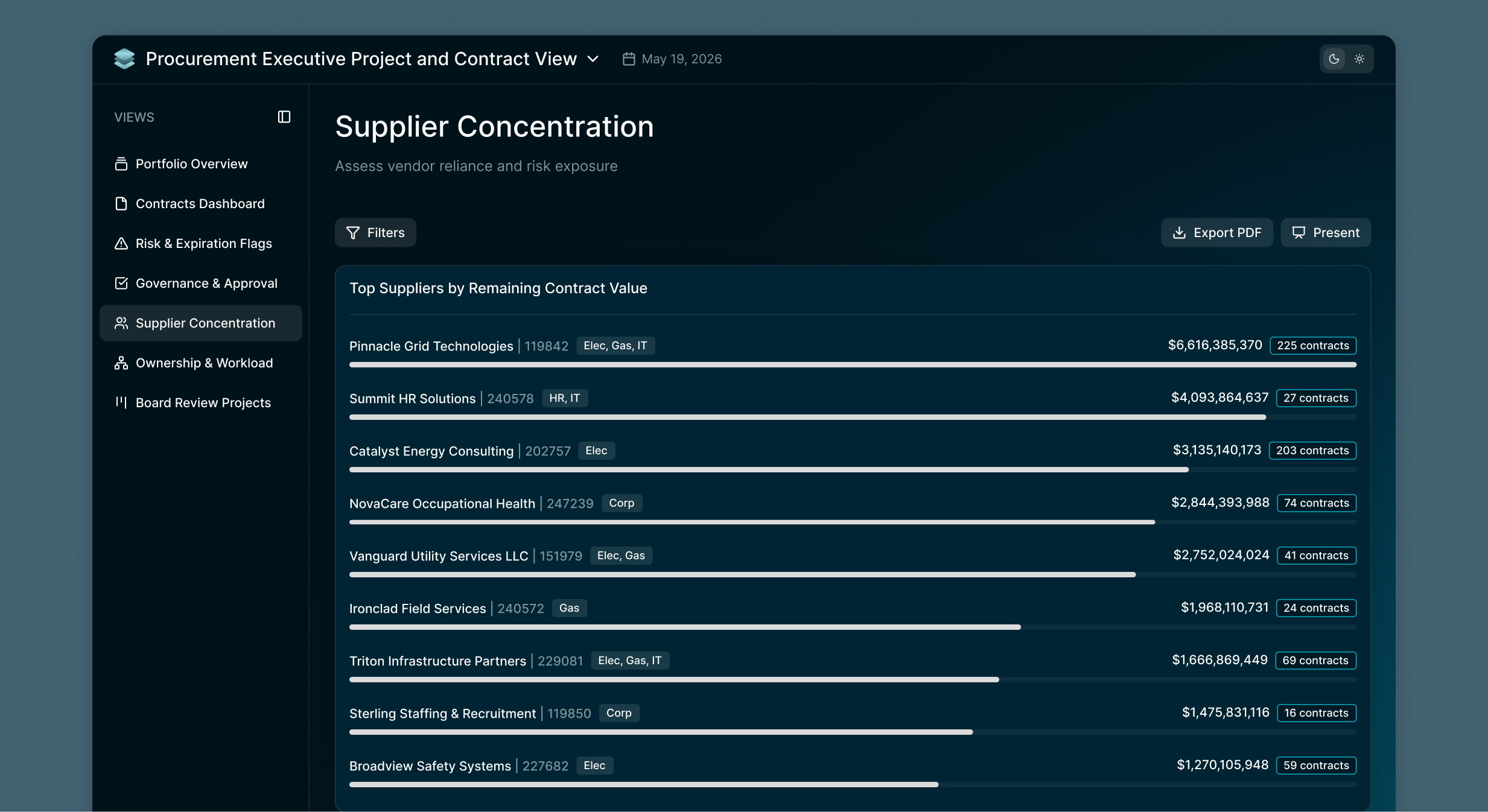
Supplier Concentration

The progress bars associated with the suppliers used different colors with no underlying meaning, which led users to assume the colors were significant when they weren’t, so I standardized color across all. I also introduced badges to visually group and separate different types of data.

BEFORE

AFTER

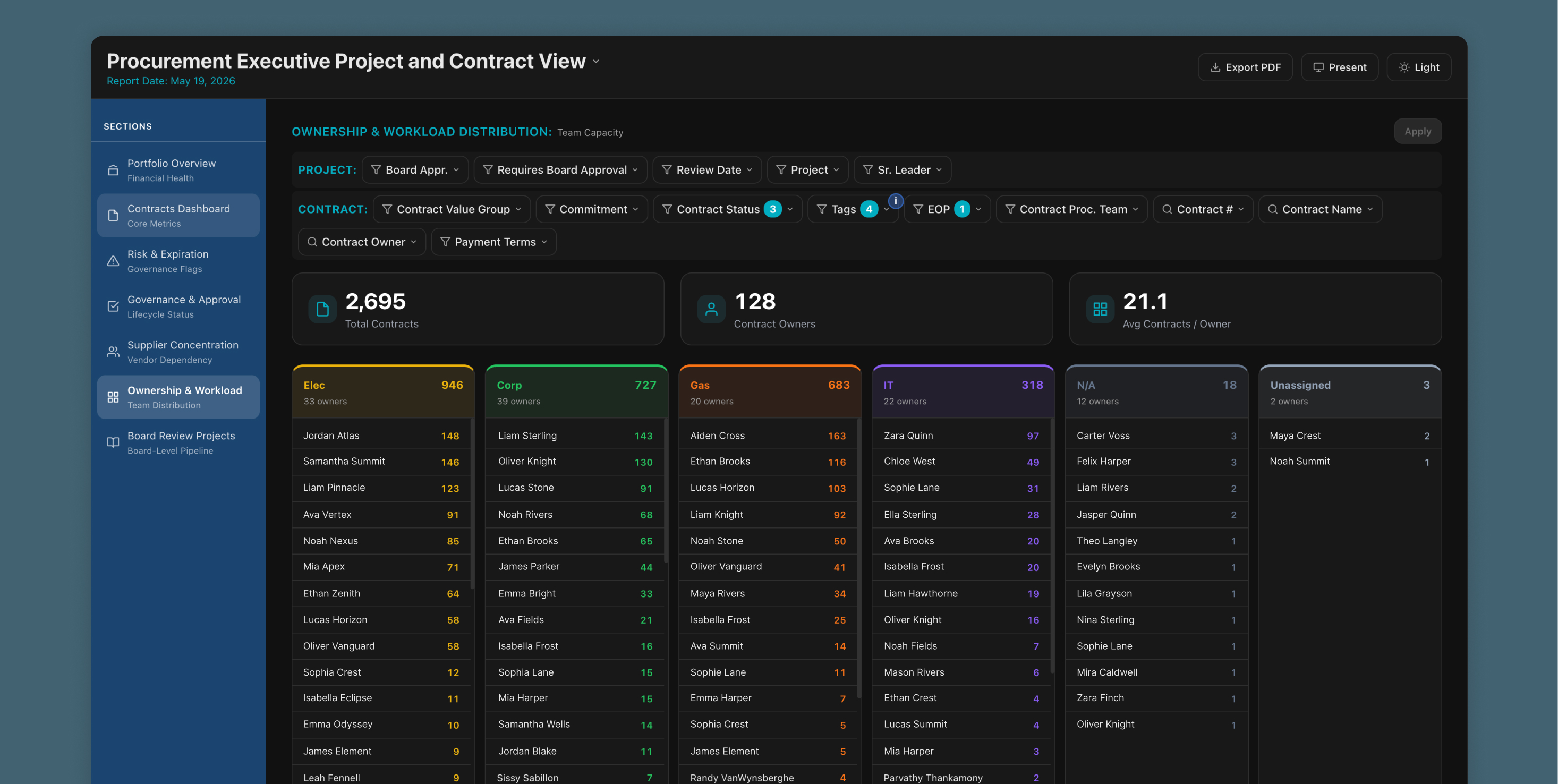
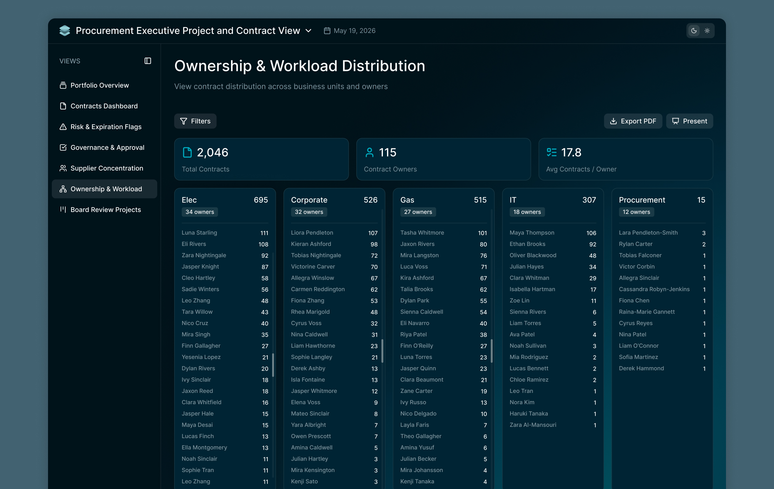
Ownership & Workload Distribution

Business sector cards used different colors with no meaning behind them, so I standardized color across all of them. Owners without a clear group were bucketed under a generic “N/A,” even though all of them belonged to Procurement, so I renamed the group to Procurement and assigned the unassigned owners into proper categories and removed the unassigned category.

BEFORE

AFTER

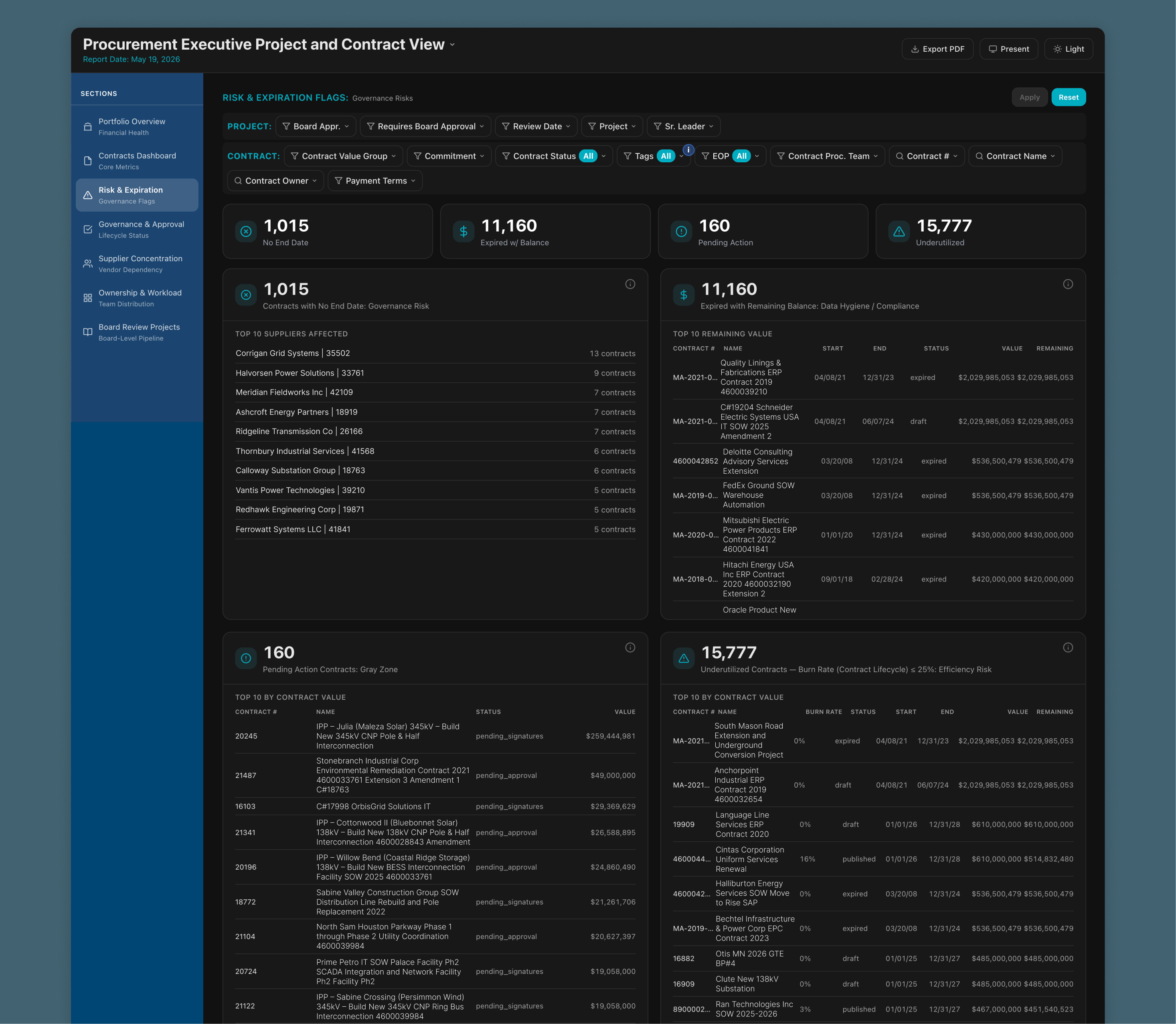
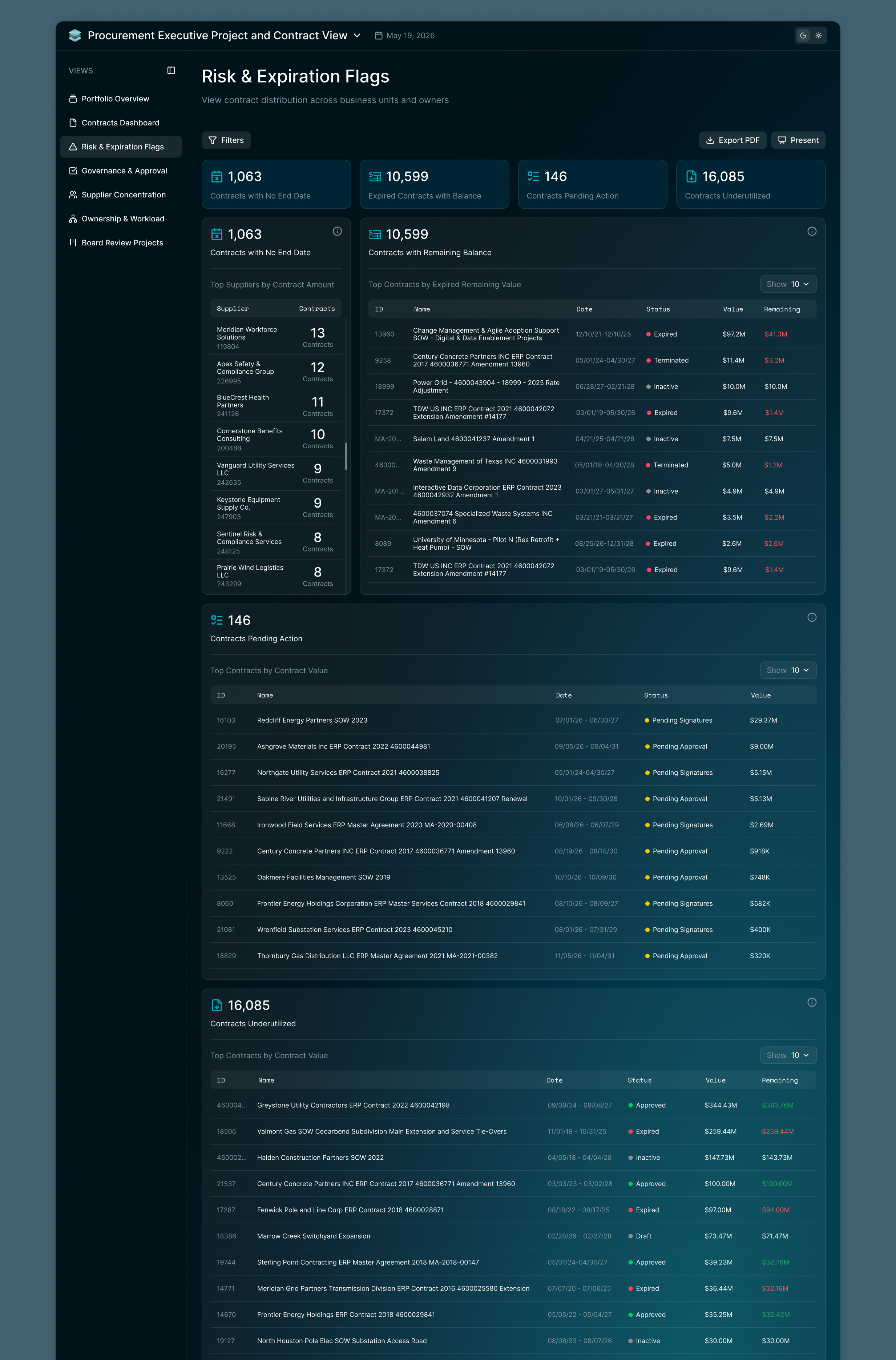
Risk & Expiration Flags

The first and second widgets had layouts that didn’t fit their content well, so I restructured both to better suit what they display. The table also relied on a single color throughout, making it hard to distinguish data or assess it at a glance. I added color to contract status for quicker understanding, and to remaining values so users could immediately tell whether a value was available or depleted.

BEFORE

AFTER

Where We Ended Up

  • A cohesive, easily scalable visual language built on the Volt Design System
  • Meaningful color and status indicators throughout, so data is readable at a glance
  • A filtering experience that stays out of the way until needed, with a drawer, removable selected filter pills, and a count badge
  • A side nav, table layout, and component set that finally match the rest of the product
  • Clear, purposeful labels and icons throughout
  • Widget layouts restructured to fit their content