j

Lorem ipsum dolor amet, consect adipiscing elit, diam nonummy.

Follow Us

Search

Volt AI Design System

Unifying AI Experiences

Summary

Context

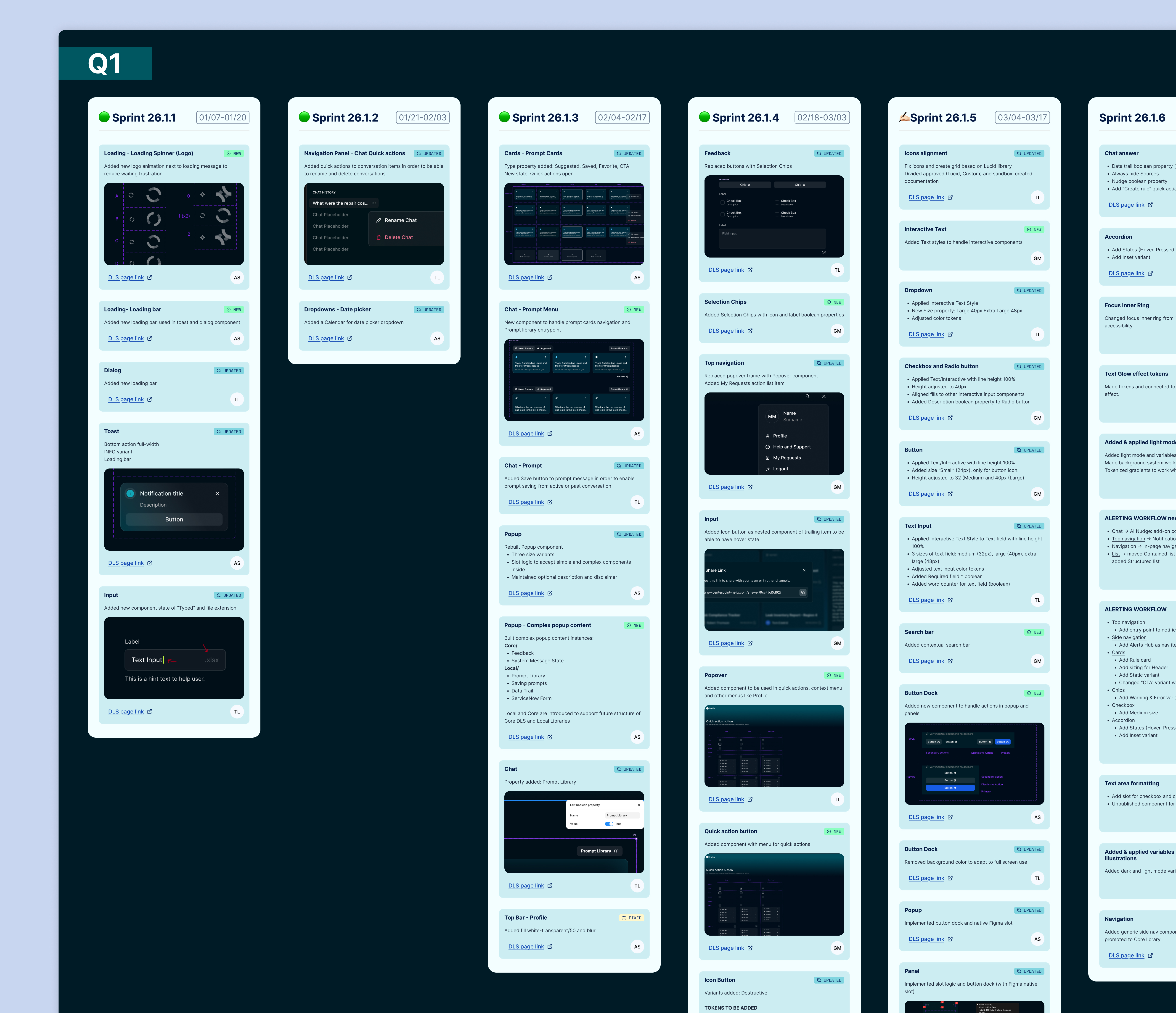
This design system was originally built alongside a single internal AI chatbot application. As the company started to add more AI tools, features, and data analytics applications, the system was scaled to become the dedicated design language for all AI and data analytics products.

The decision to have a separate system specifically for AI and data applications is because AI products need a different overall aesthetic, one that signals to users they’re in an AI experience and interacting with AI. A dedicated system made it possible to build that visual language consistently across every product, while streamlining both design and development and strengthening the brand.

My Role

I was part of the team that designed Helix, the first product built on this system. This included establishing the initial components and structure of the design system. I was responsible for setting up all design tokens and documentation, and for creating the light mode theming.

As other applications began adopting the system, I facilitated the setup of product-specific component library extensions, ensuring each one referenced the right variables or created new ones to suit the component’s needs, while maintaining the same structural accuracy and consistency as the core system.

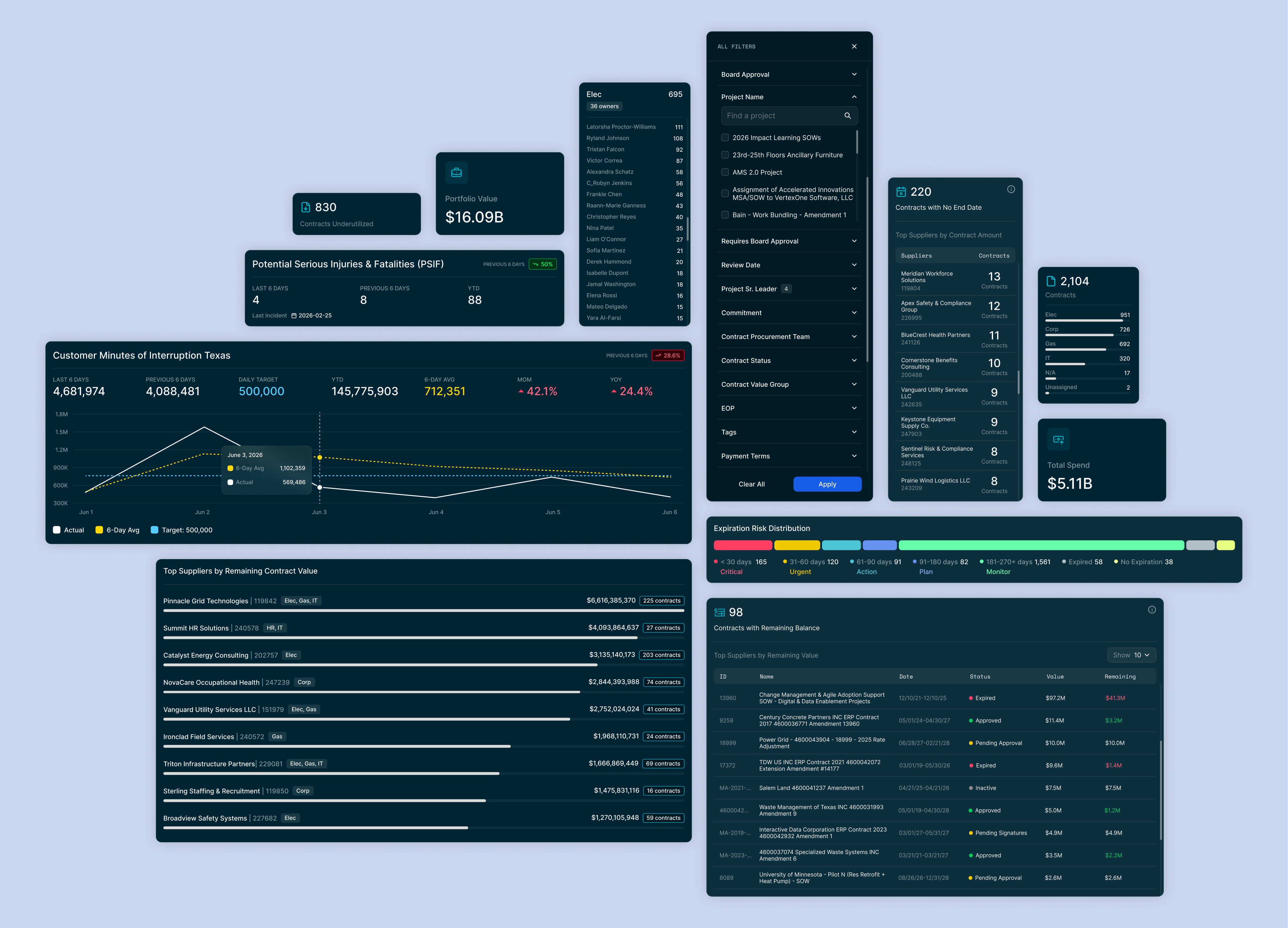
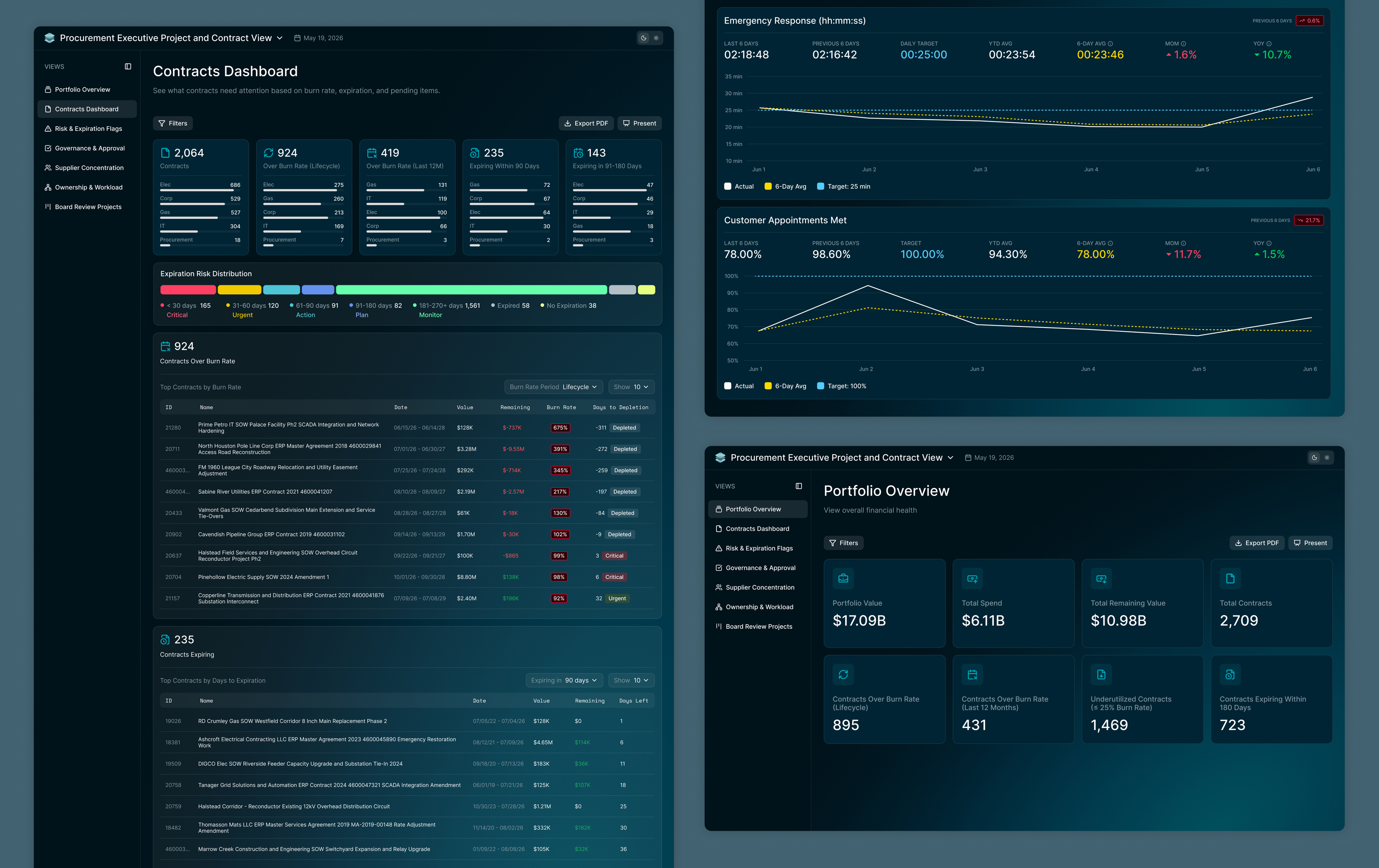
I used the system in redesigning a supply chain analytics application as well, Analytics Hub.

Foundations

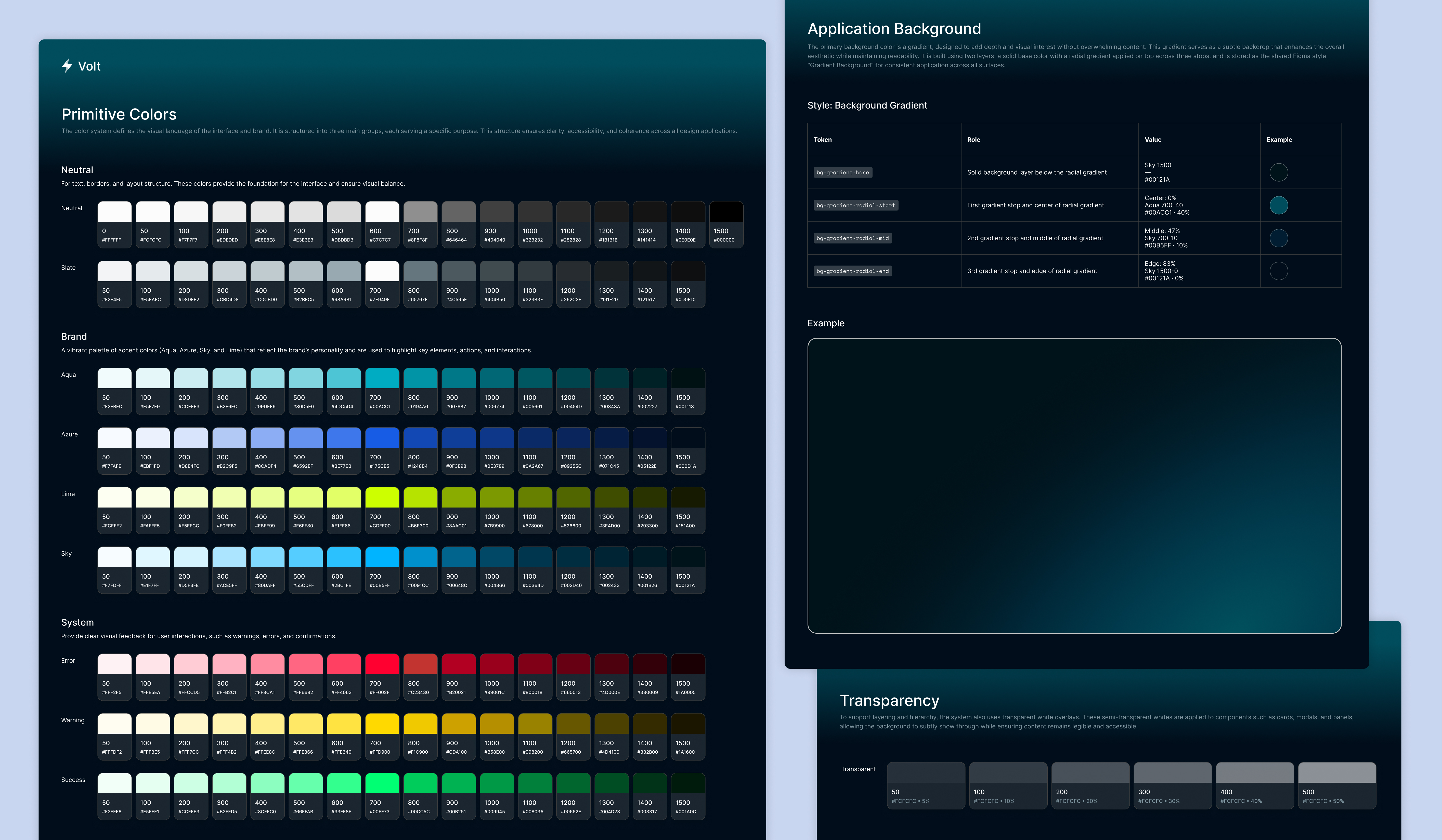
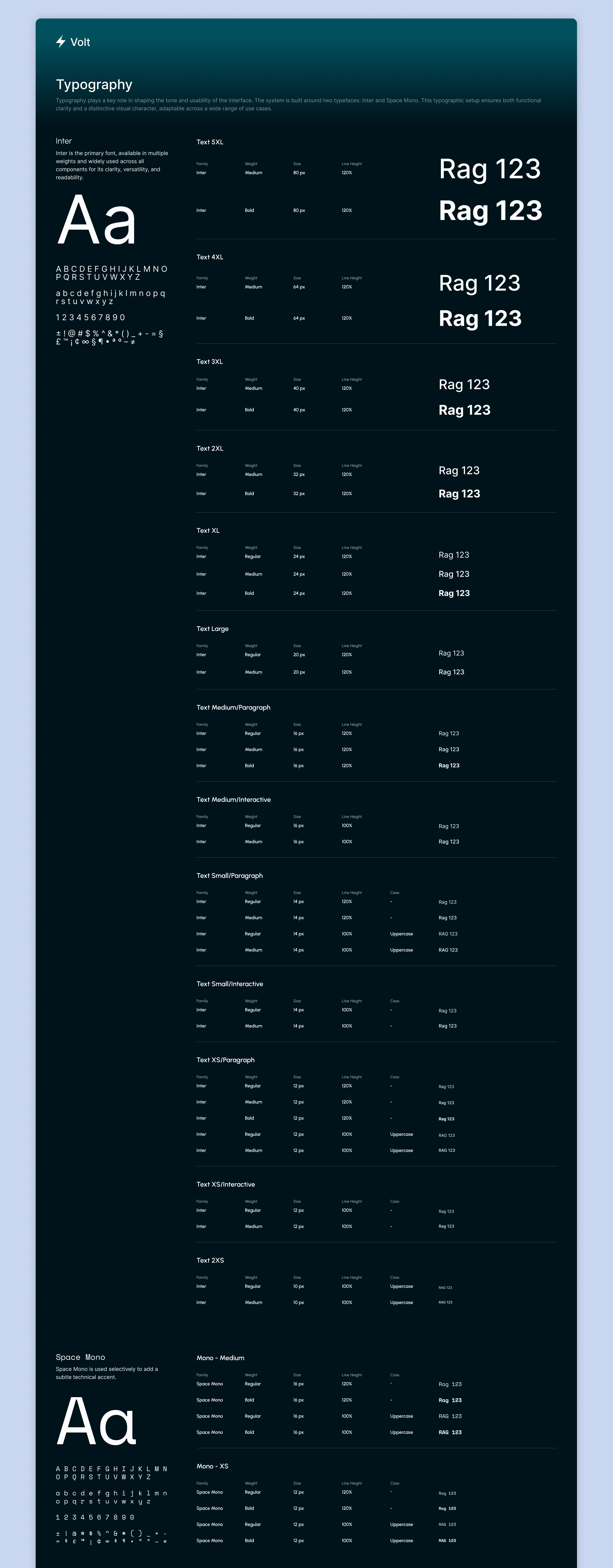
Colors & Type

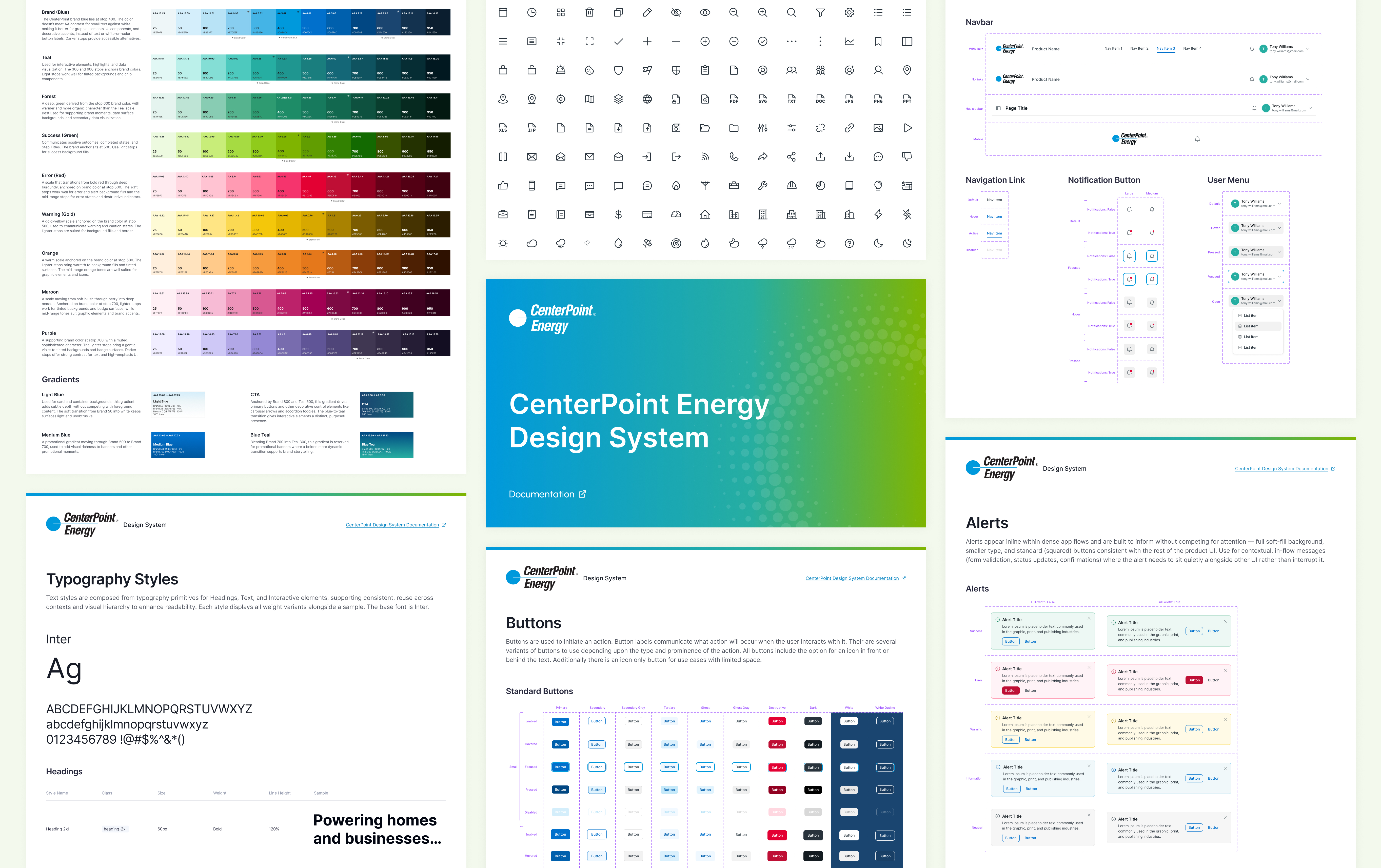
We wanted the system to feel custom, distinct from typical AI chat applications, rather than generic or templated. The foundation was built on vibrant tech colors, neon accents, and gradients, with a consistent gradient applied as the primary background across all screens. We paired Inter with a monospace font, using the mono typeface decoratively to reinforce a technical, digital feel.

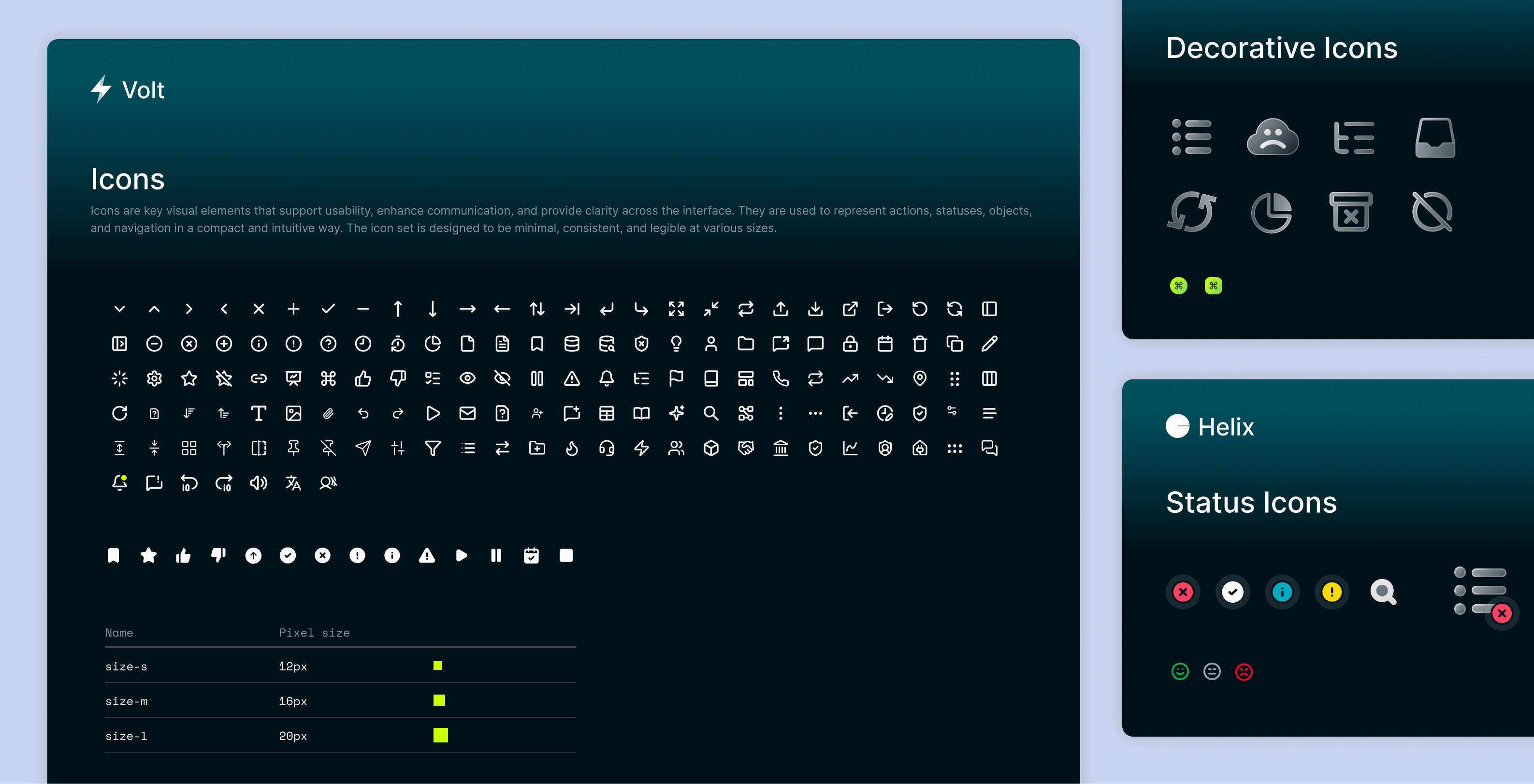
Icons

We used modern line icons within UI components to emphasize their meaning, icon badges with a distinct lime gradient to communicate AI interaction, and decorative  and status icons to add visual emphasis and clarity to status indicators and empty state messaging.

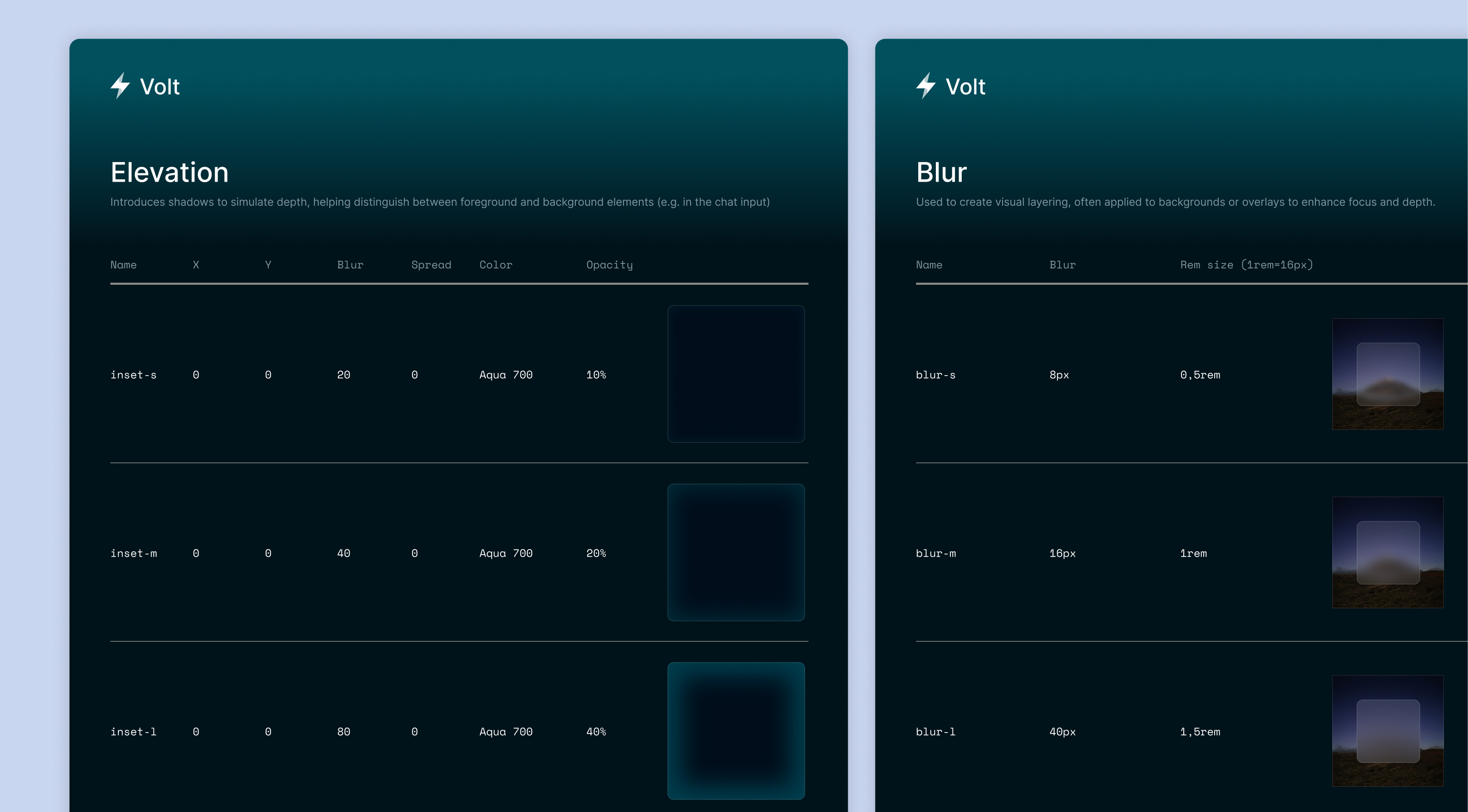
Effects

Glow effects were applied to text and chat input fields to reinforce the AI association and create a digital, futuristic feel. Blur effects were used on overlay backgrounds to add depth and focus to the top layer and produce a softer layer behind the primary surface.

Grids, Spacing, & Radius

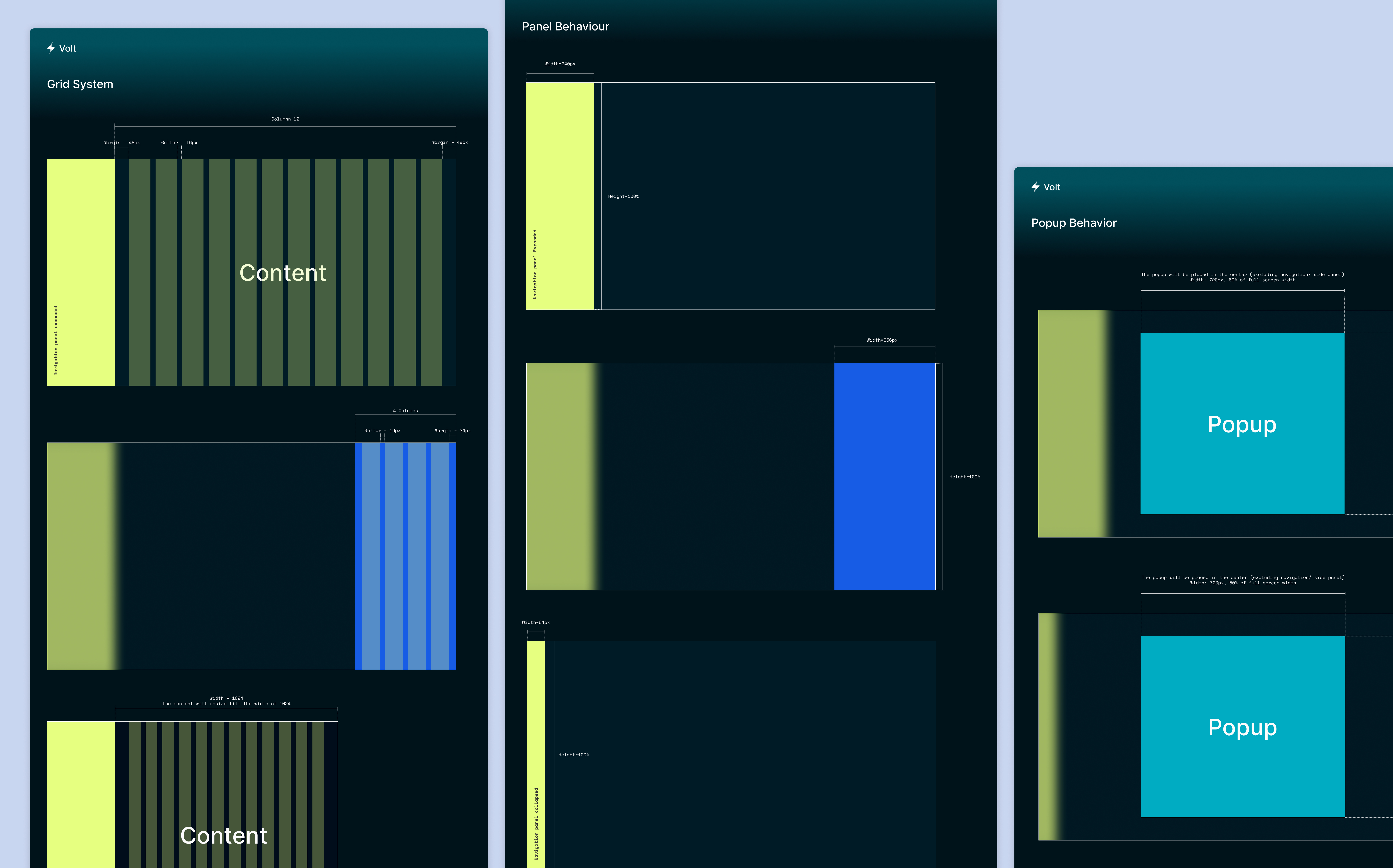
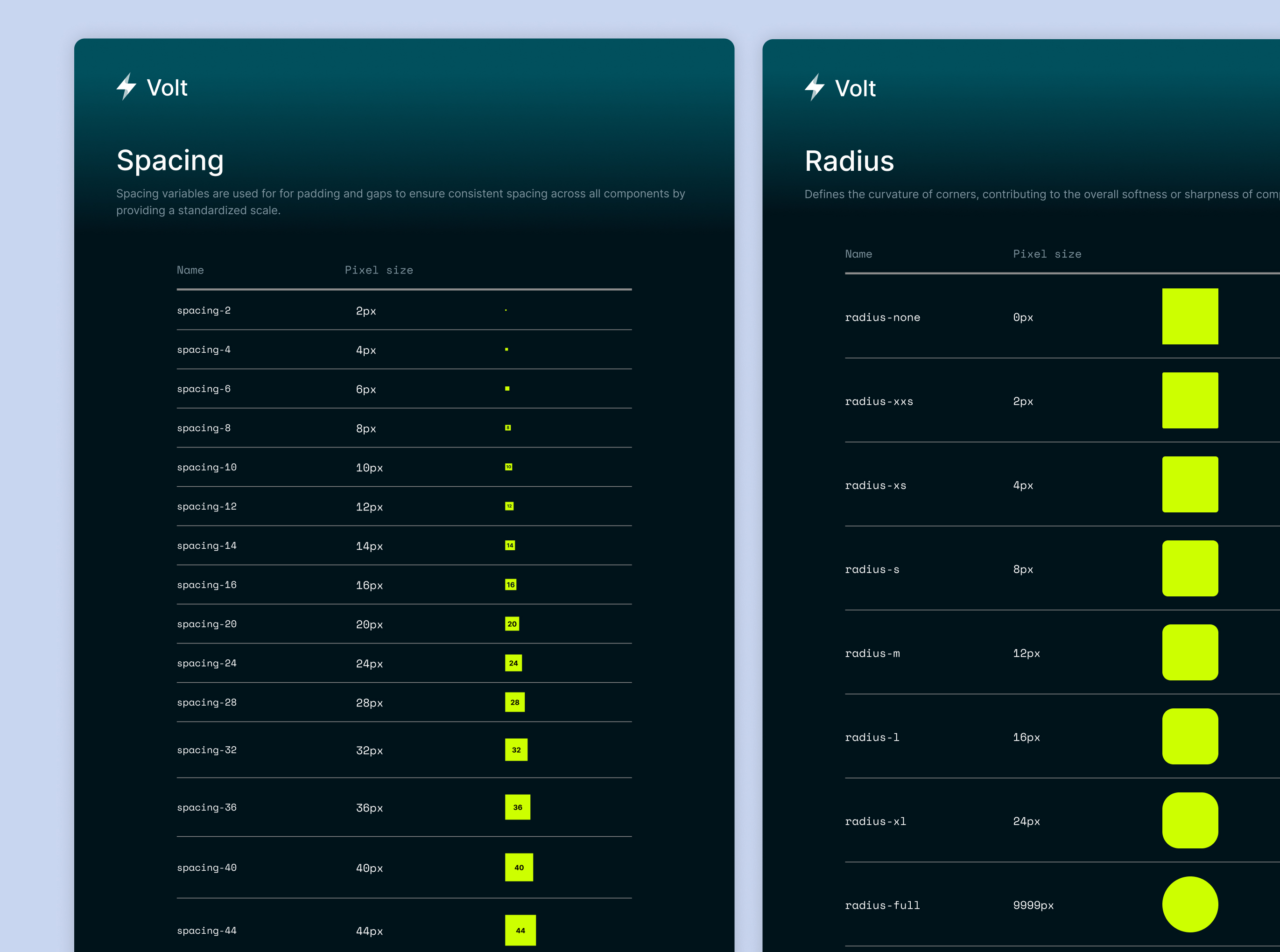
These foundational tokens define the system’s structure, establishing consistent layout, spacing, and corner curvature across all components. Grids outlined a collapsible sidebar navigation, a left side panel overlay, and a popup modal.

Components

Core Components

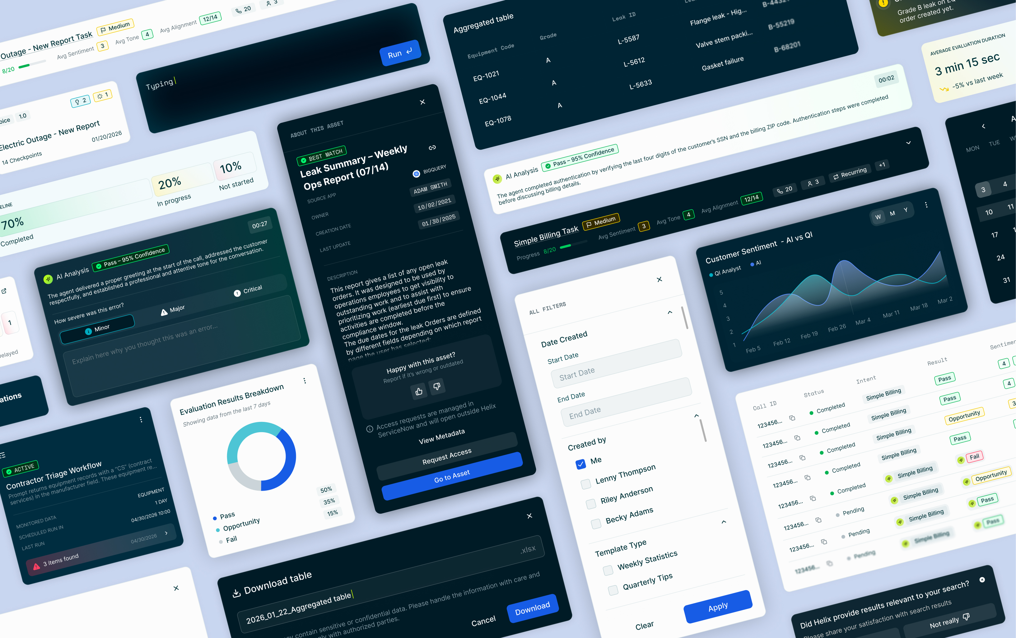
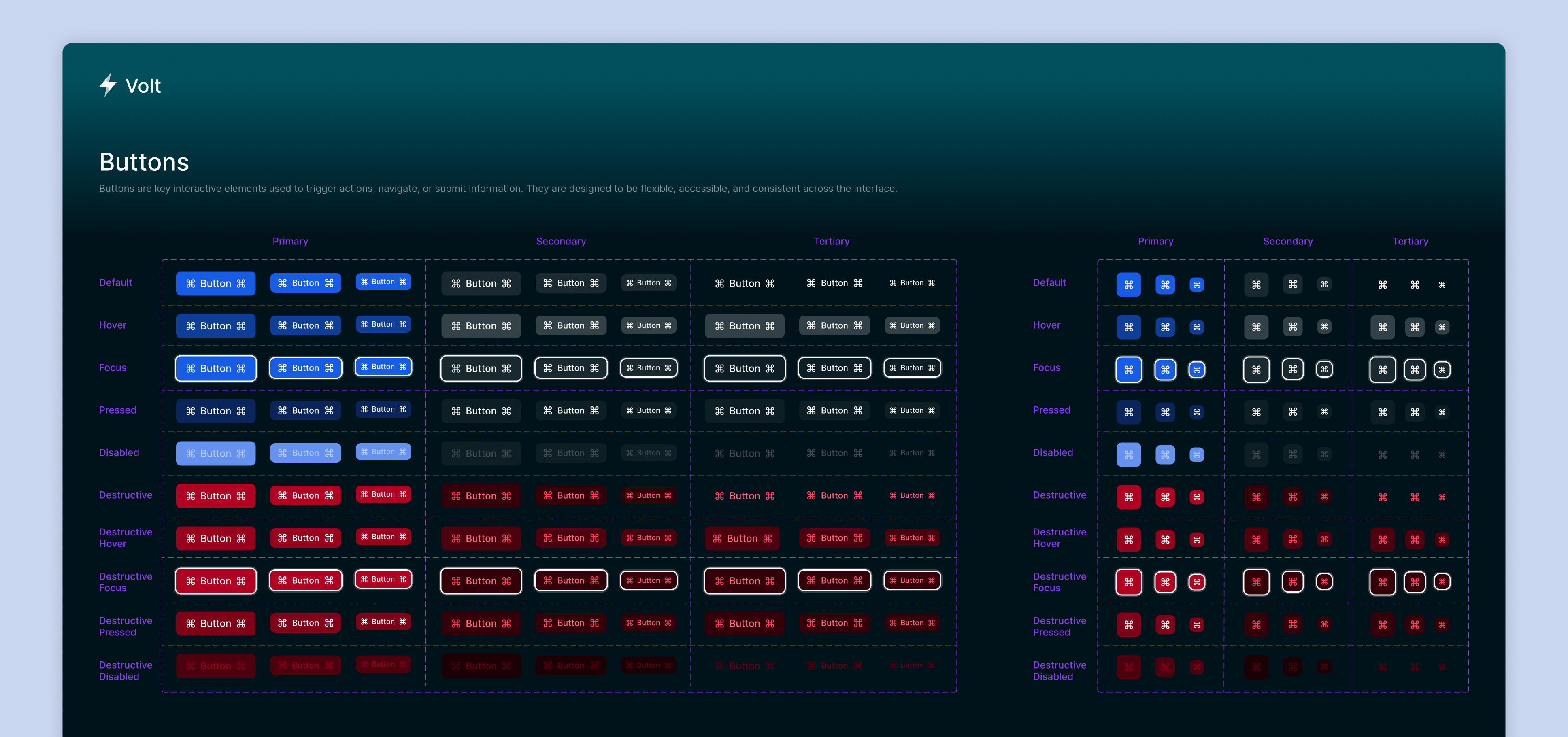
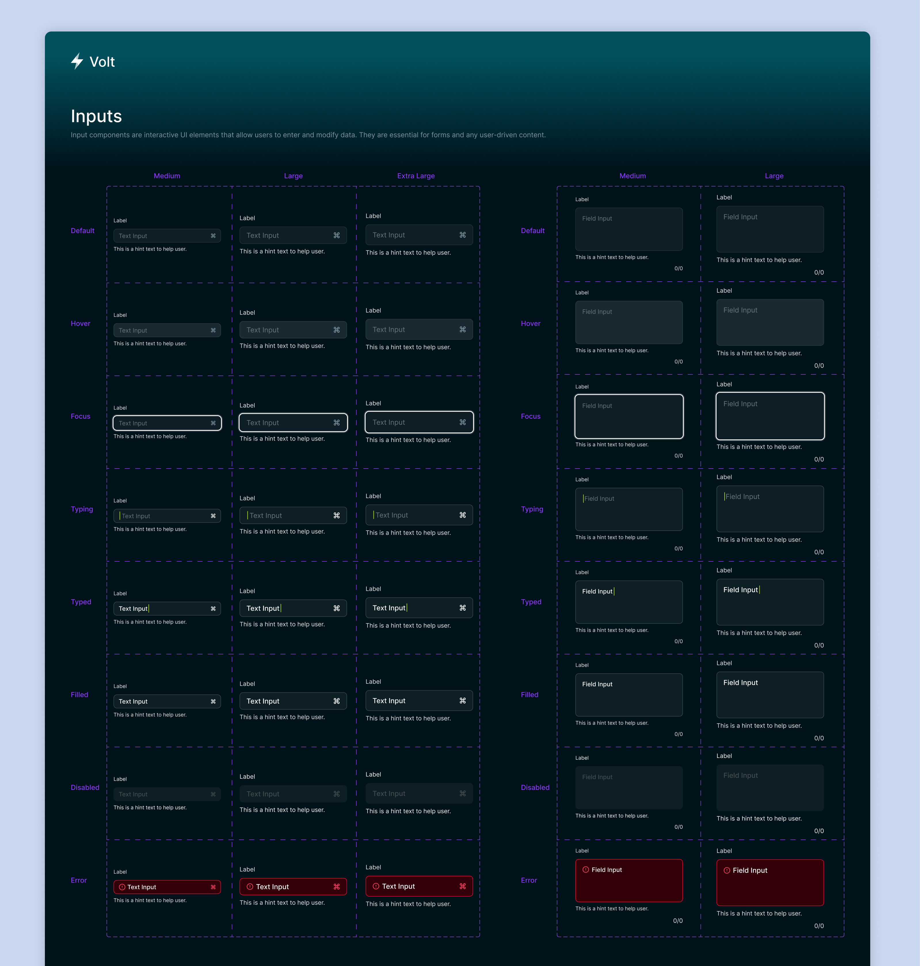
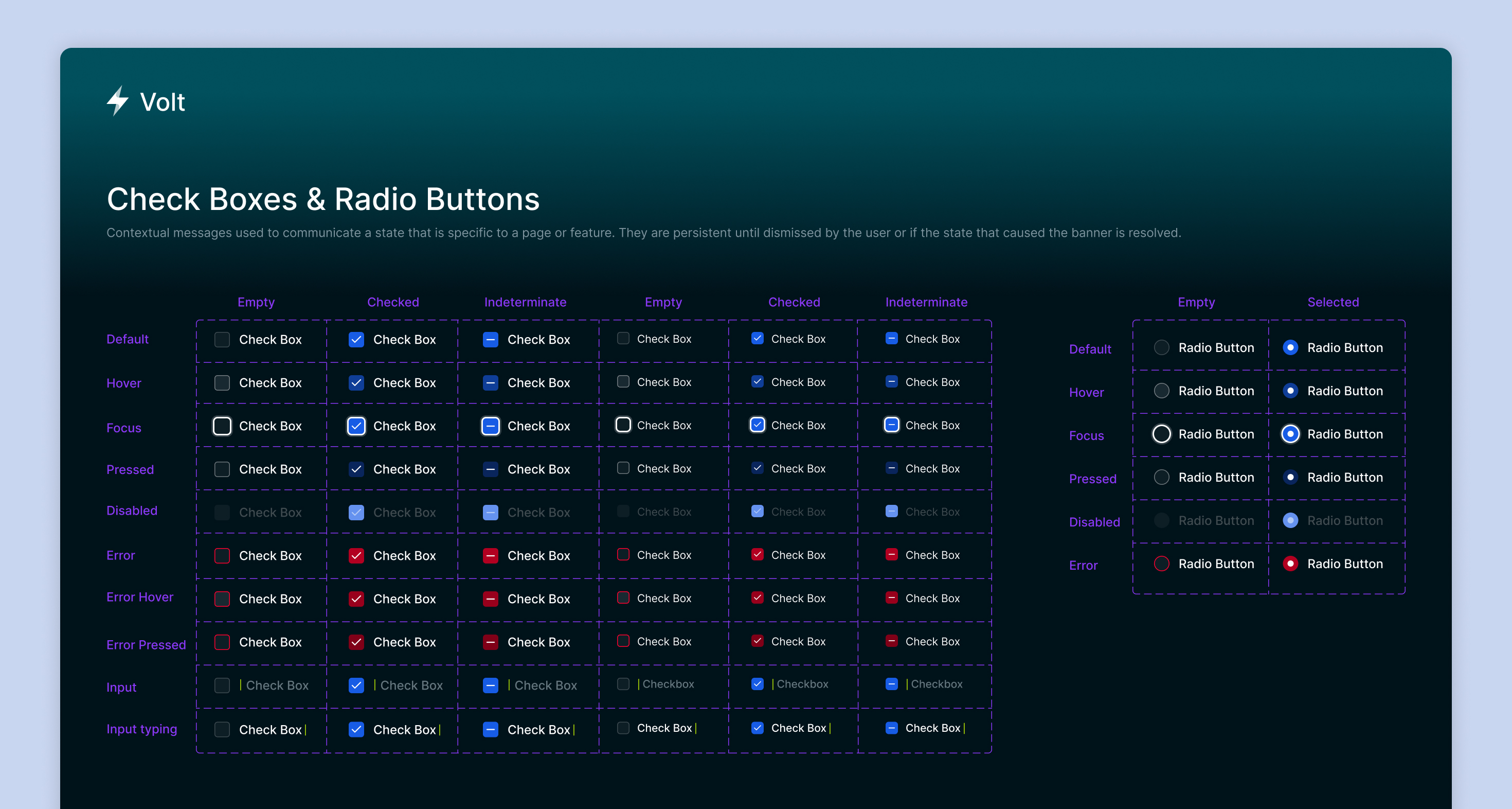
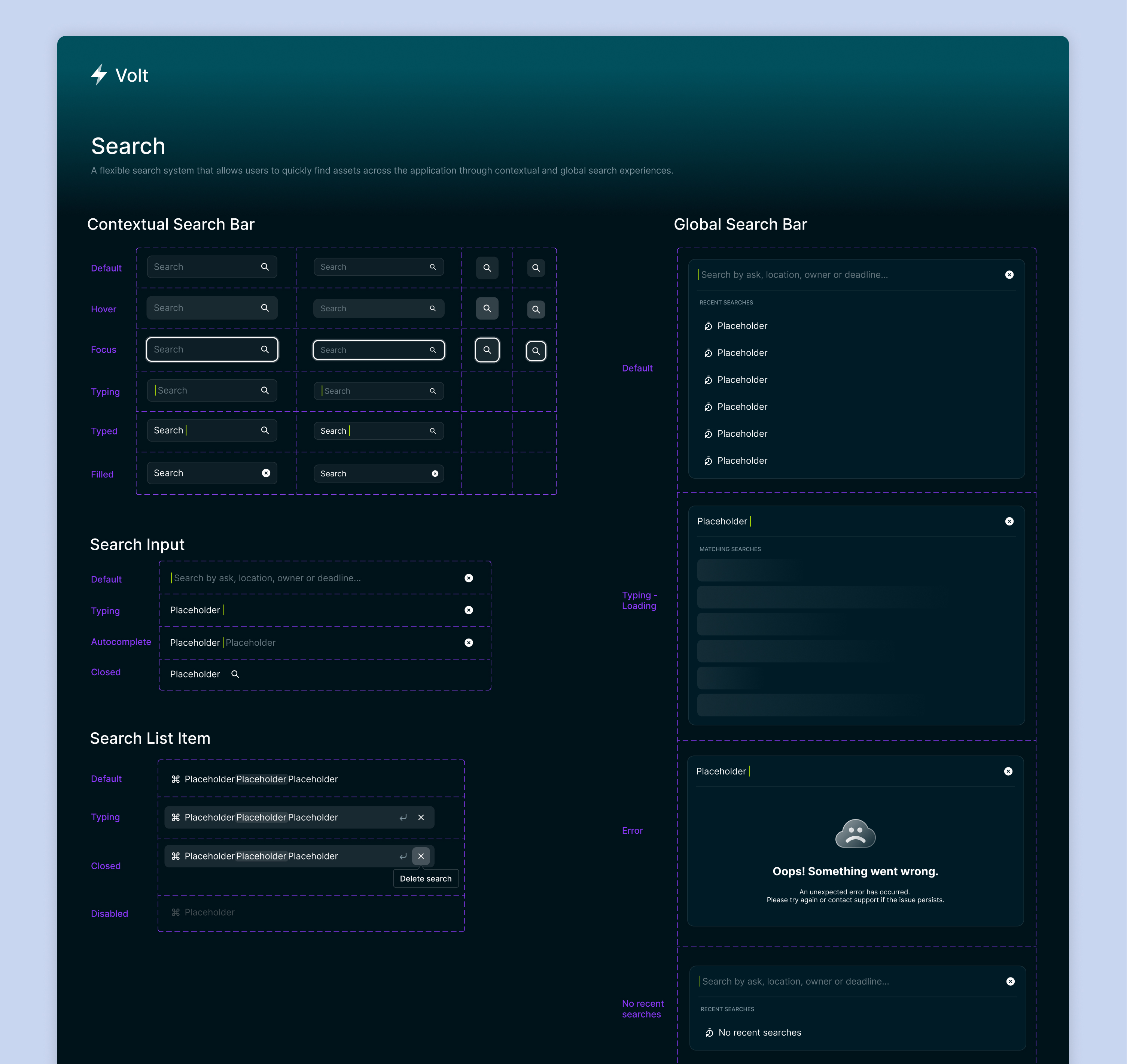
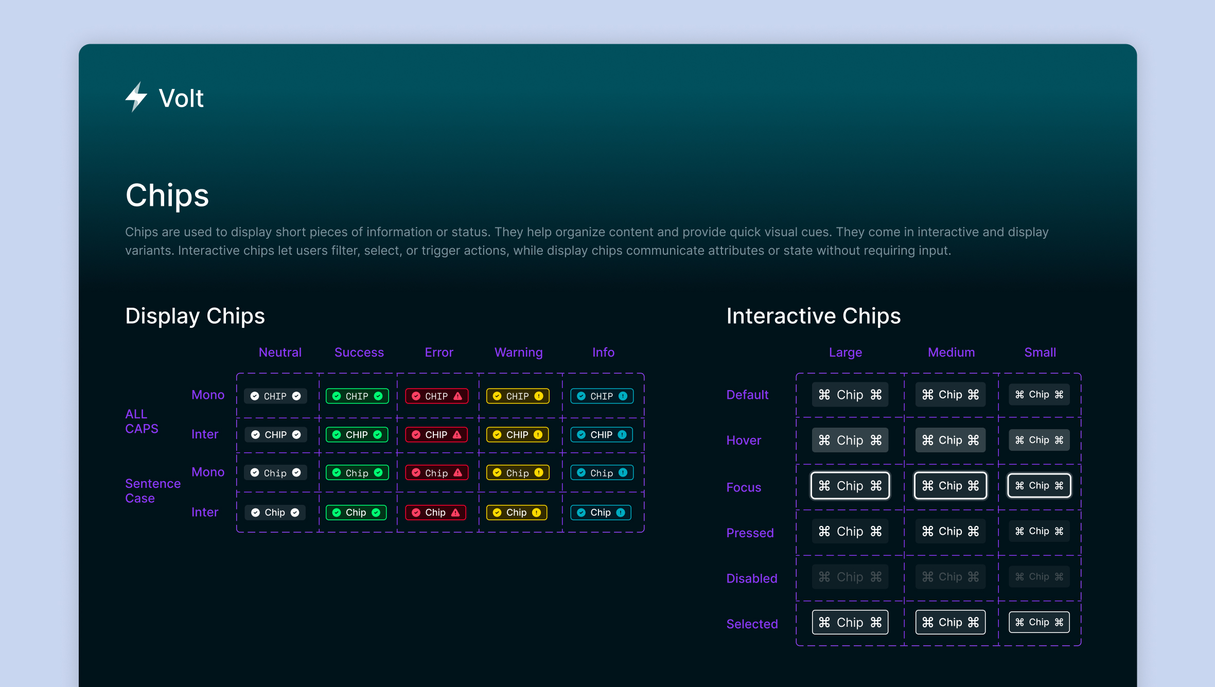
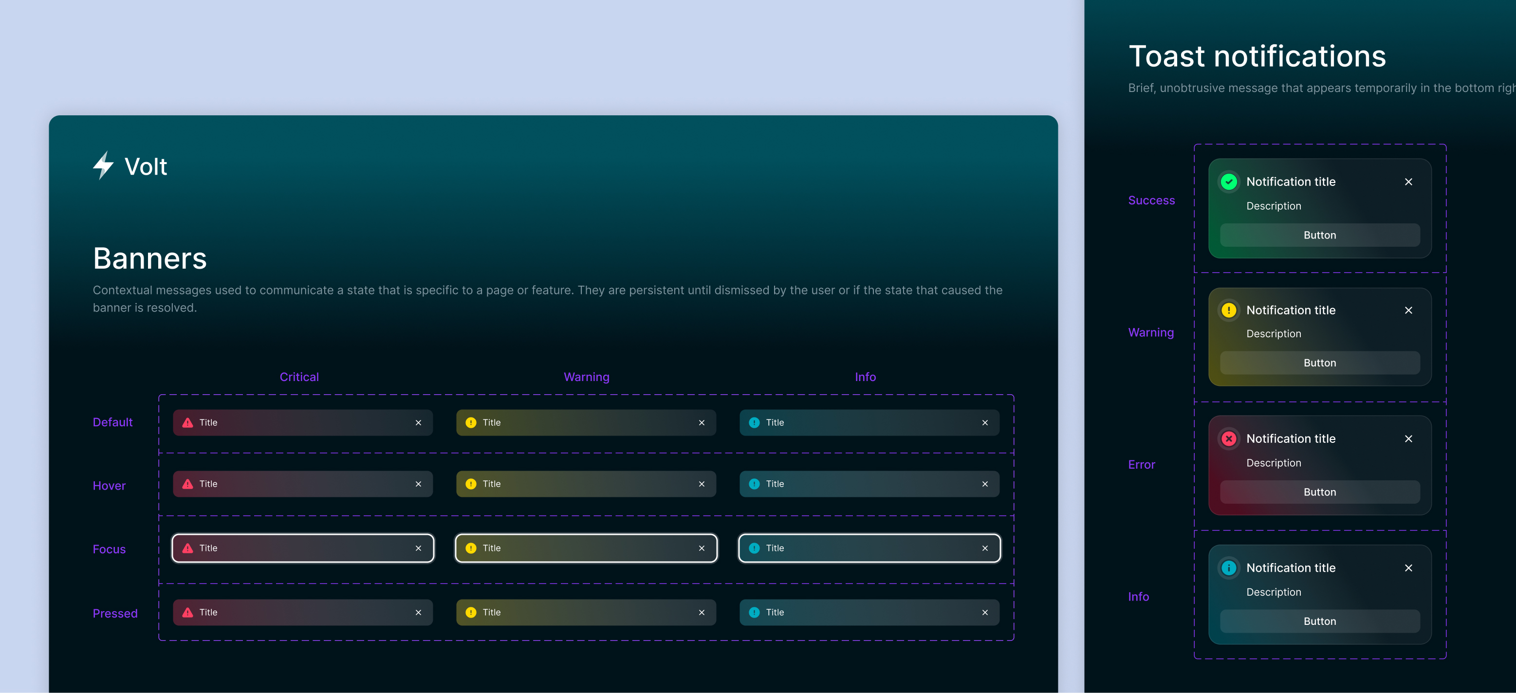
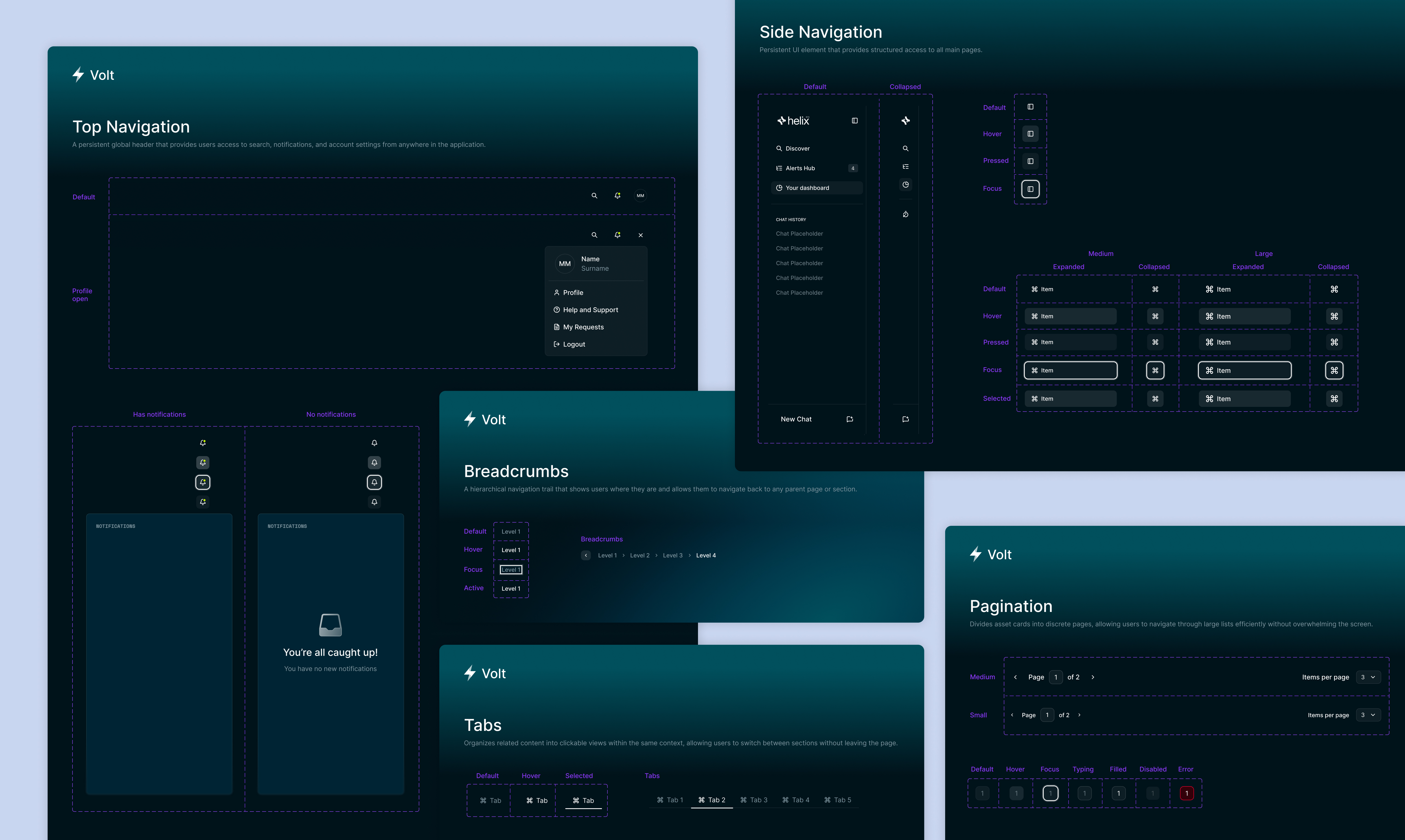
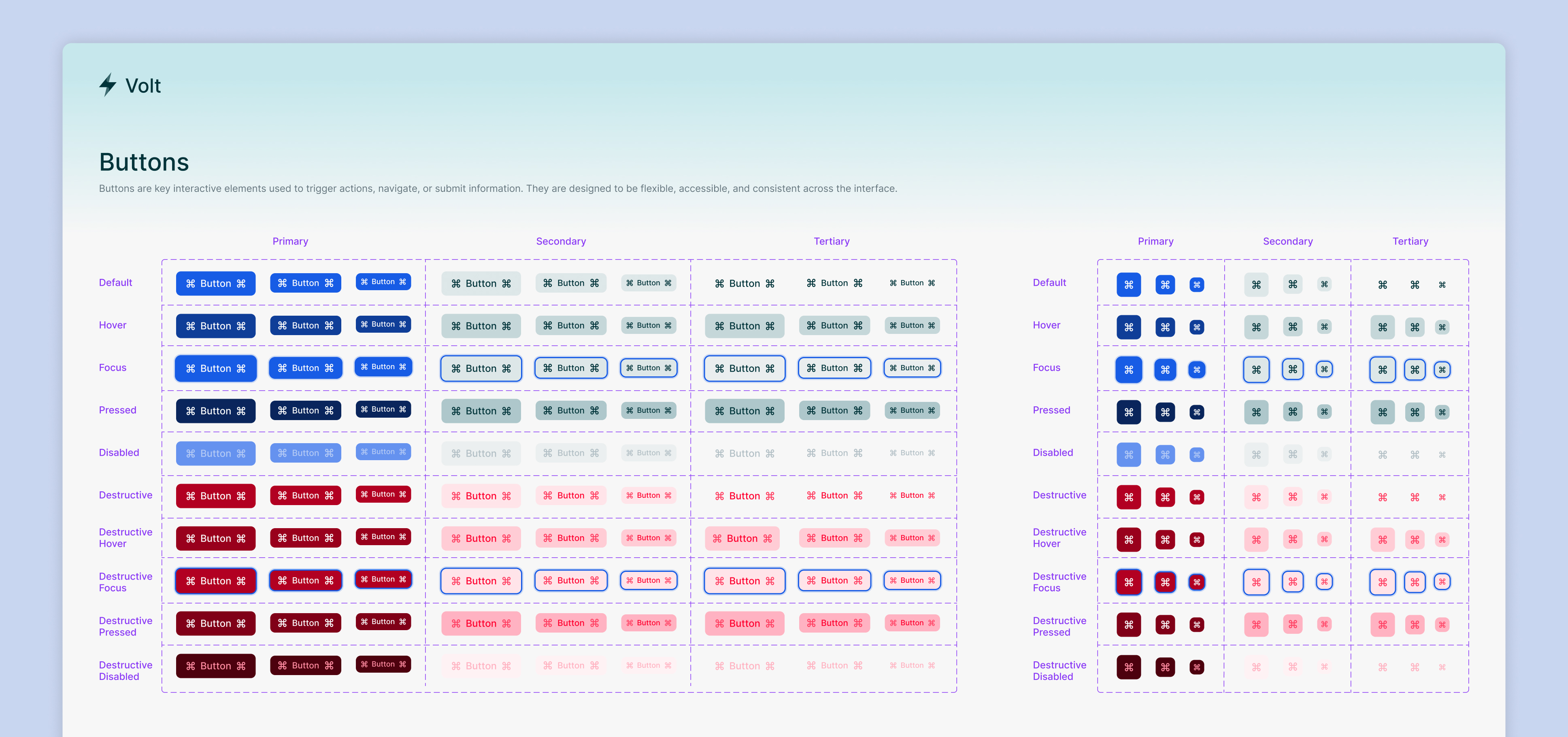
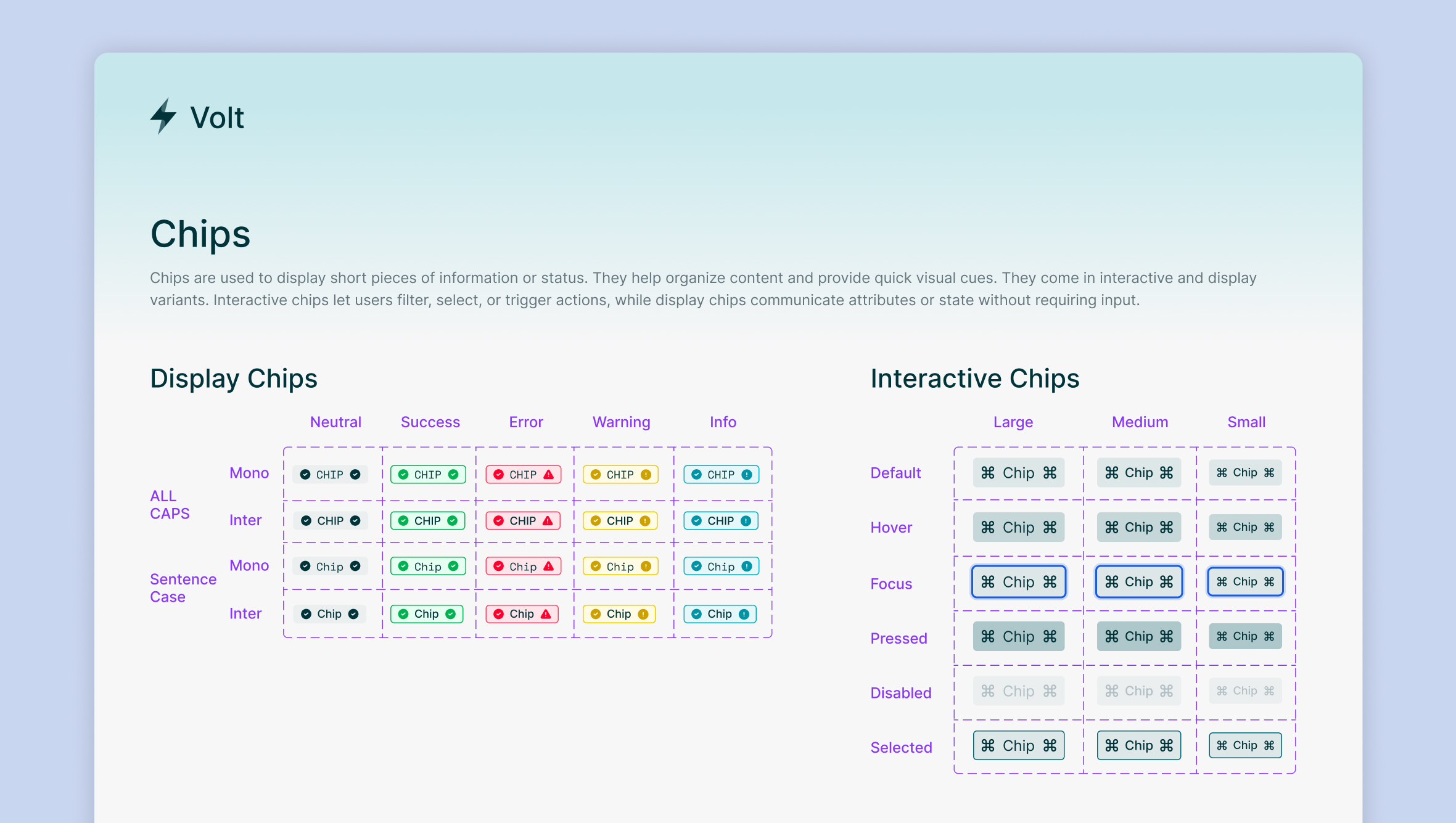
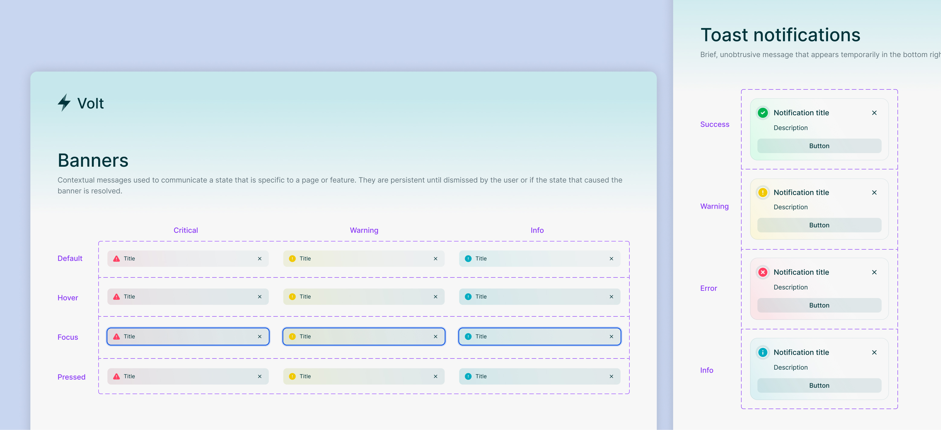
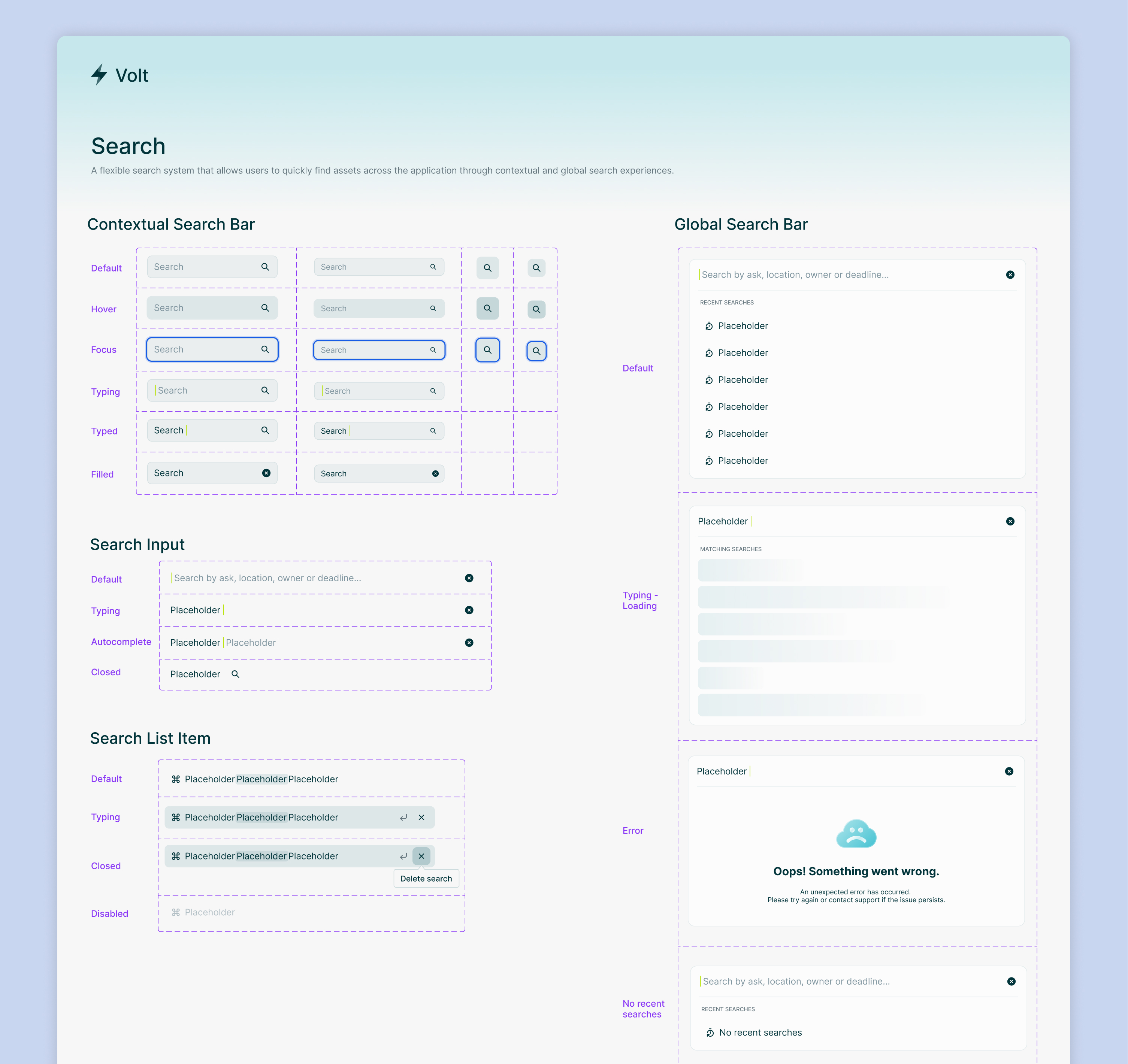
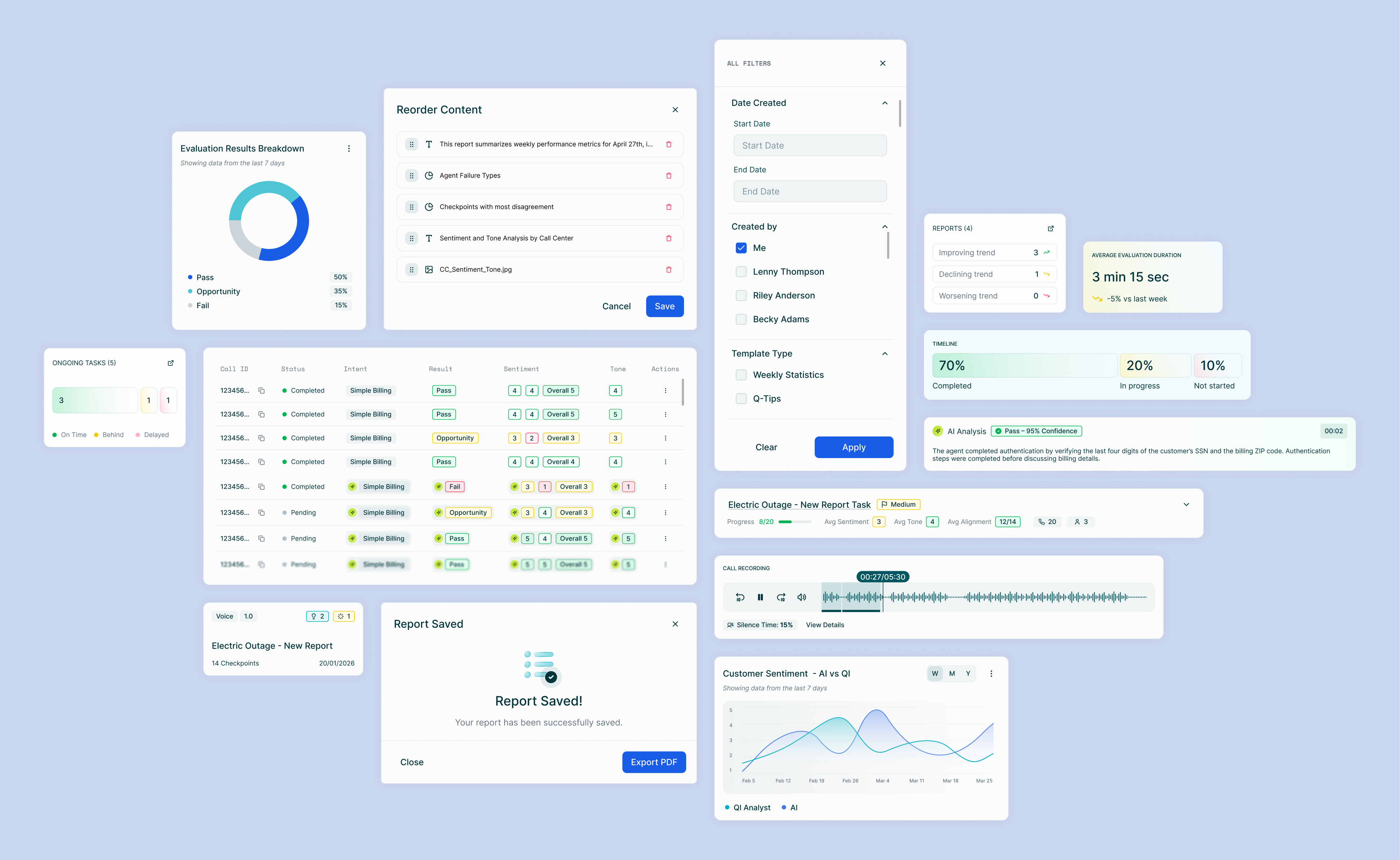
These included essential base components as well as more complex components built by combining them with other elements. Below are just a few of the components we created.

Light & Dark Mode

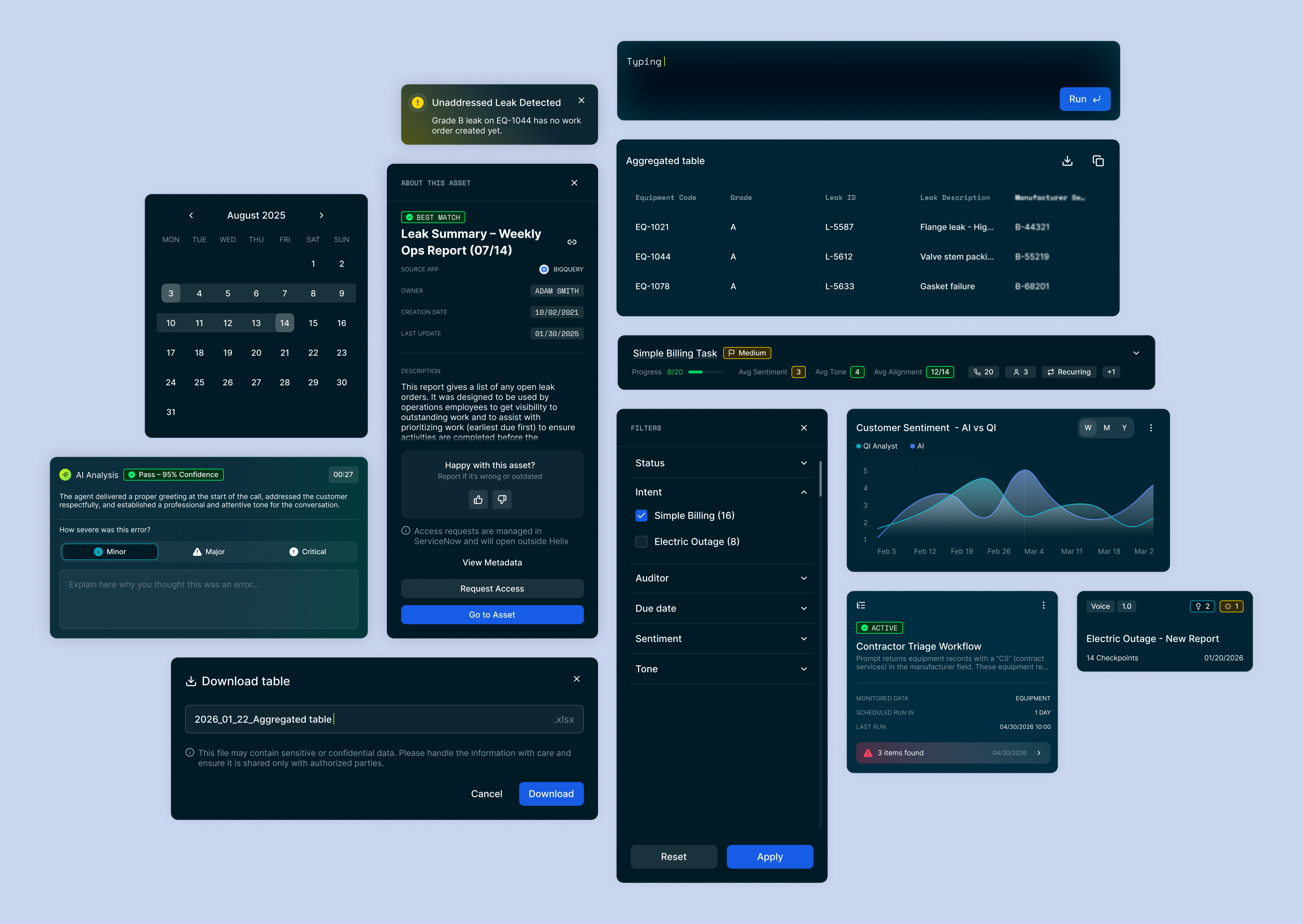
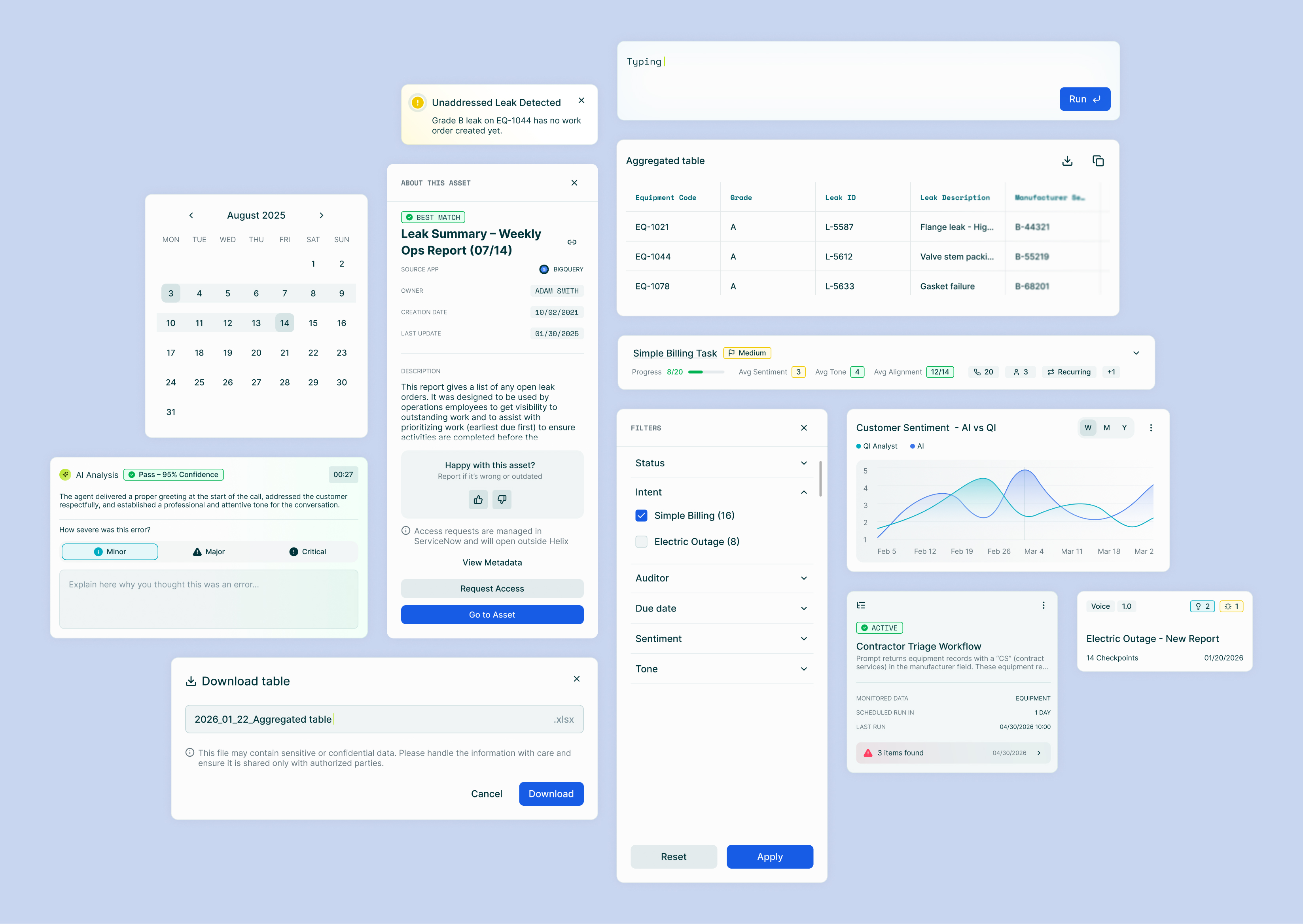
The system was originally built in dark mode only, since the first product it supported was only in dark mode initially. I designed the light mode version of the application and built out the corresponding light mode theming and token set. This made it possible for the original product to support light mode, and allowed other products built on the system to have a light mode foundation.

Product Specific Component Libraries

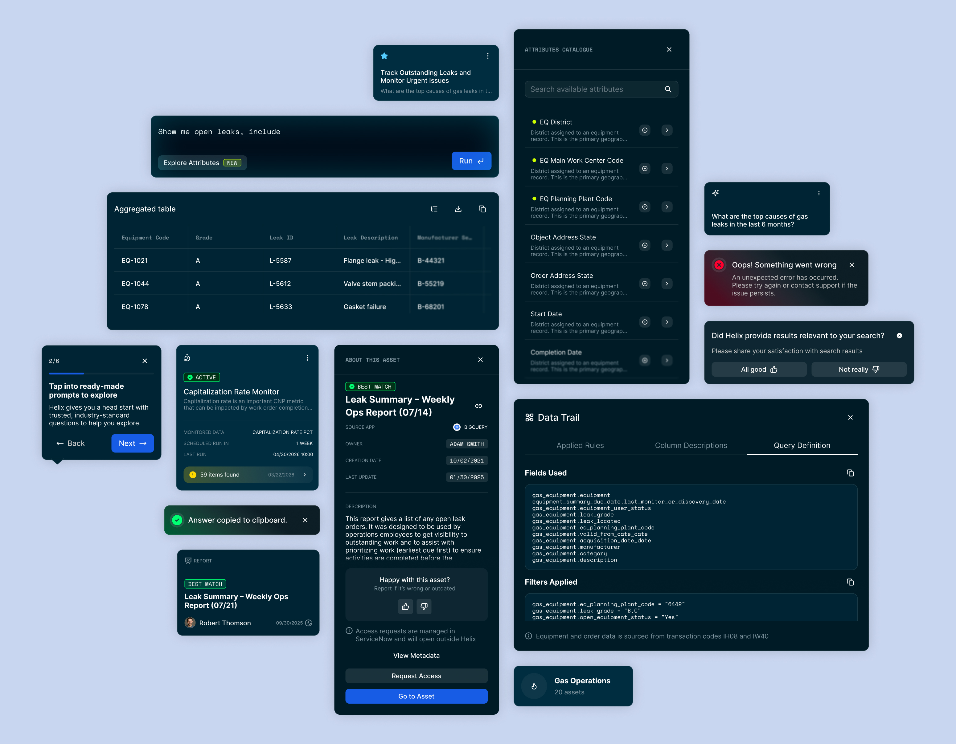
As the system expanded to new applications, we broke out components unique to individual products into their own dedicated libraries, keeping the core system clean while still giving each product room for its specific needs.

Helix component library
CX Studio component library
Analytics Hub component library

Documentation

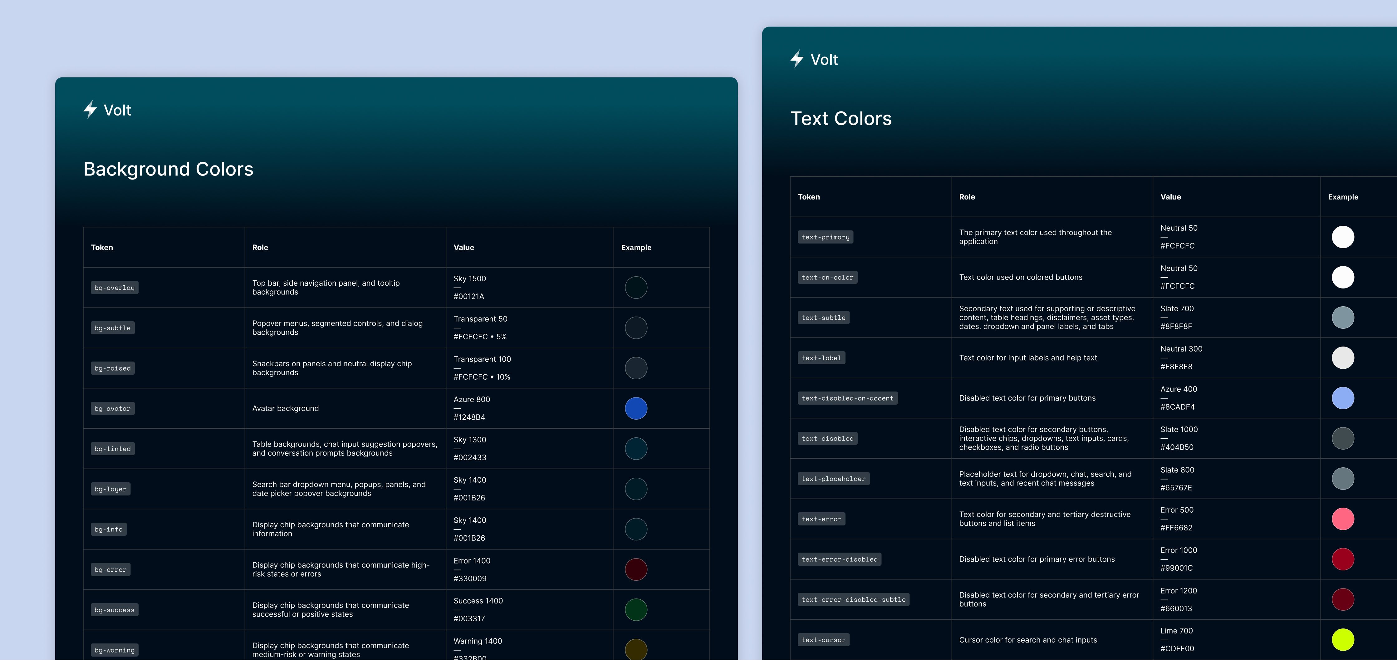
Token Documentation

I documented the meaning and intended use of every token in the system, giving designers and developers a clear reference point for accurate, consistent usage.

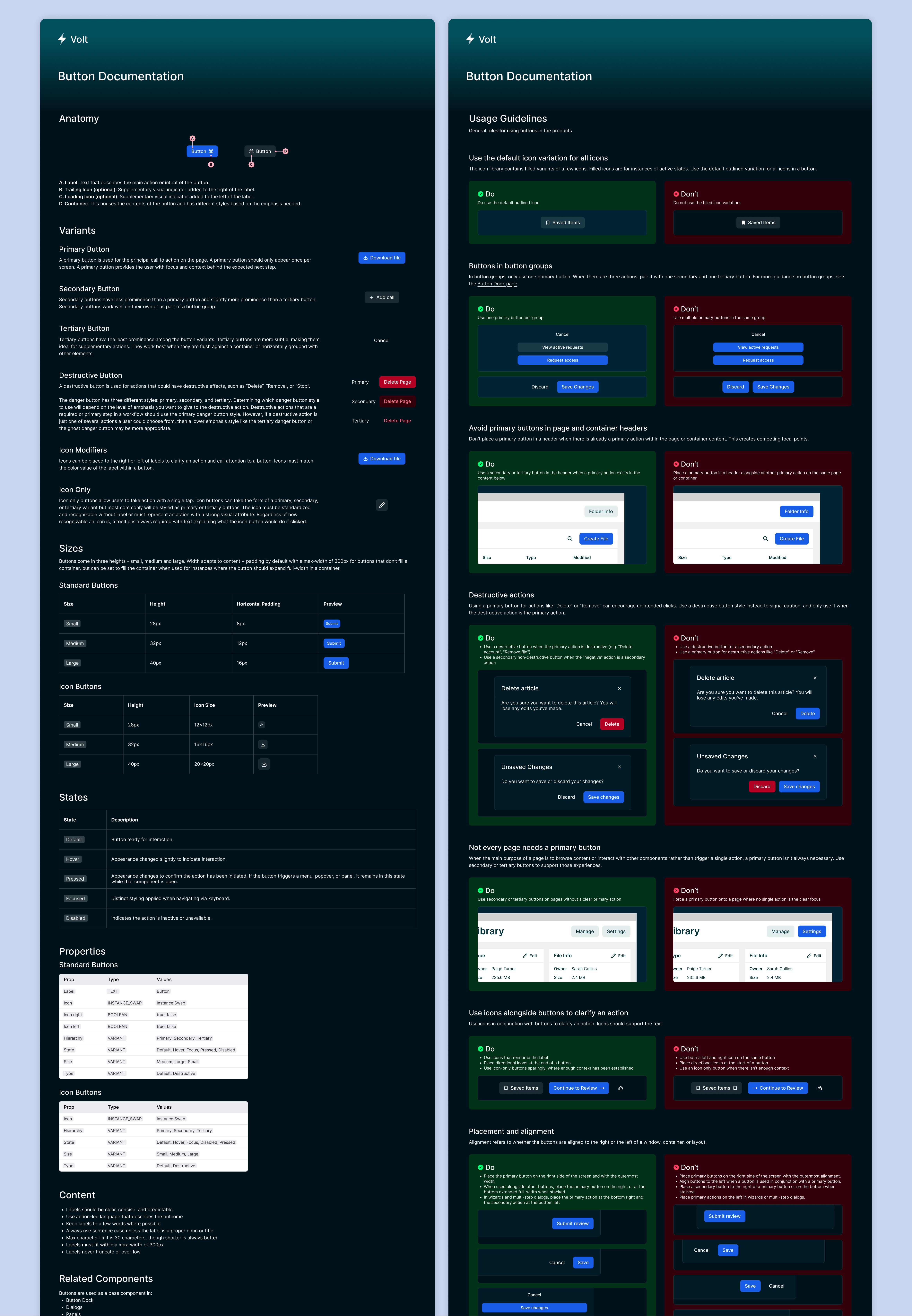
Component Documentation

I created detailed documentation for each component, covering available variants, sizing, do’s and don’ts, and props. This gave designers a clear guide for using each component correctly, ensuring consistency across applications and adherence to UI/UX principles, while giving developers what they needed to build accurately without guesswork.

This documentation also laid the groundwork for a Claude skill and MCP to be built using the design system.

What the Volt Design System Delivered

  • A consistent visual language across multiple AI and data analytics products, cutting redundant work spent rebuilding components, debating design decisions, and duplicating code across teams
  • Token structure and documentation ensured styles and components were used correctly and consistently
  • Light and dark mode theming giving every product using the system the flexibility to support both themes or just one
  • Product-specific component libraries, giving individual applications room for their own needs