j

Lorem ipsum dolor amet, consect adipiscing elit, diam nonummy.

Follow Us

Search

CenterPoint Energy Account App

Adding Value to a Utility App

Summary

Context

CenterPoint Energy, a major electricity and gas provider, needed its customer-facing app redesigned to utilize a new enterprise design system I created based on new branding styles. Beyond the visual update, the app needed optimized usability, with content restructured so the right information showed up in the right places to help users understand their bill, complete payments, make sense of their usage, and view and report outages. It also needed to provide clearer, more actionable usage data.

My Role

  • Audited current screens and flows
  • Restructured content and information architecture
  • Mapped key flows and content structure
  • Utilized a new enterprise design system I had created to redesign the app and align it with CenterPoint’s updated branding
  • Developed initial iterations with prototypes
  • Structured and conducted moderated usability testing, gathered insights, and refined screens

The Problem

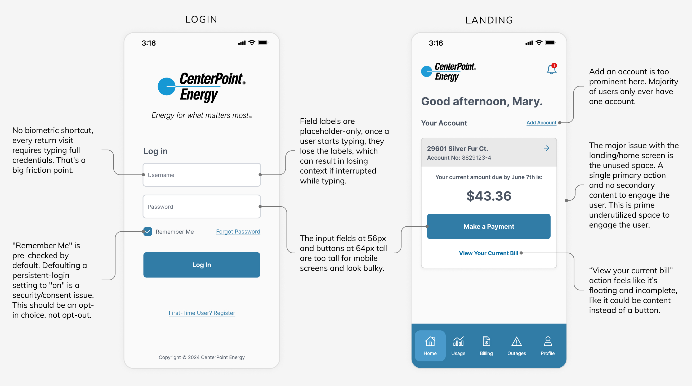
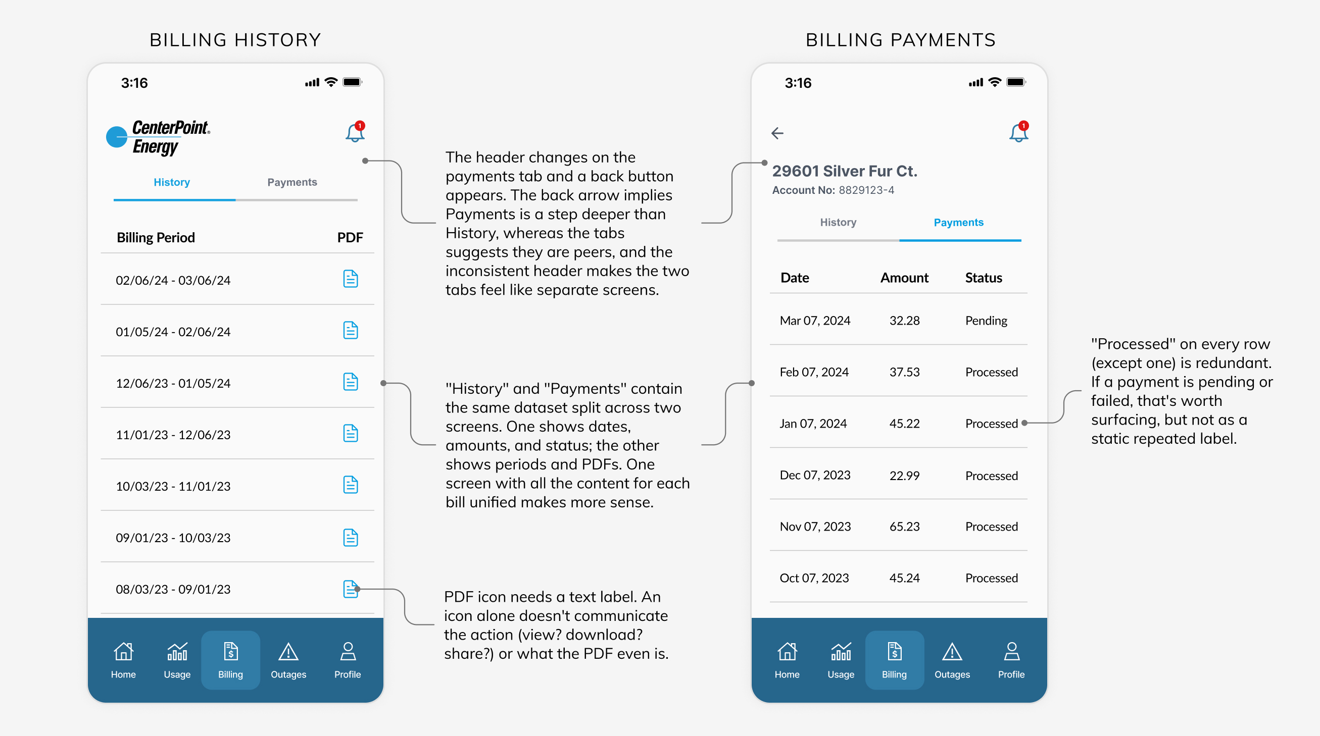
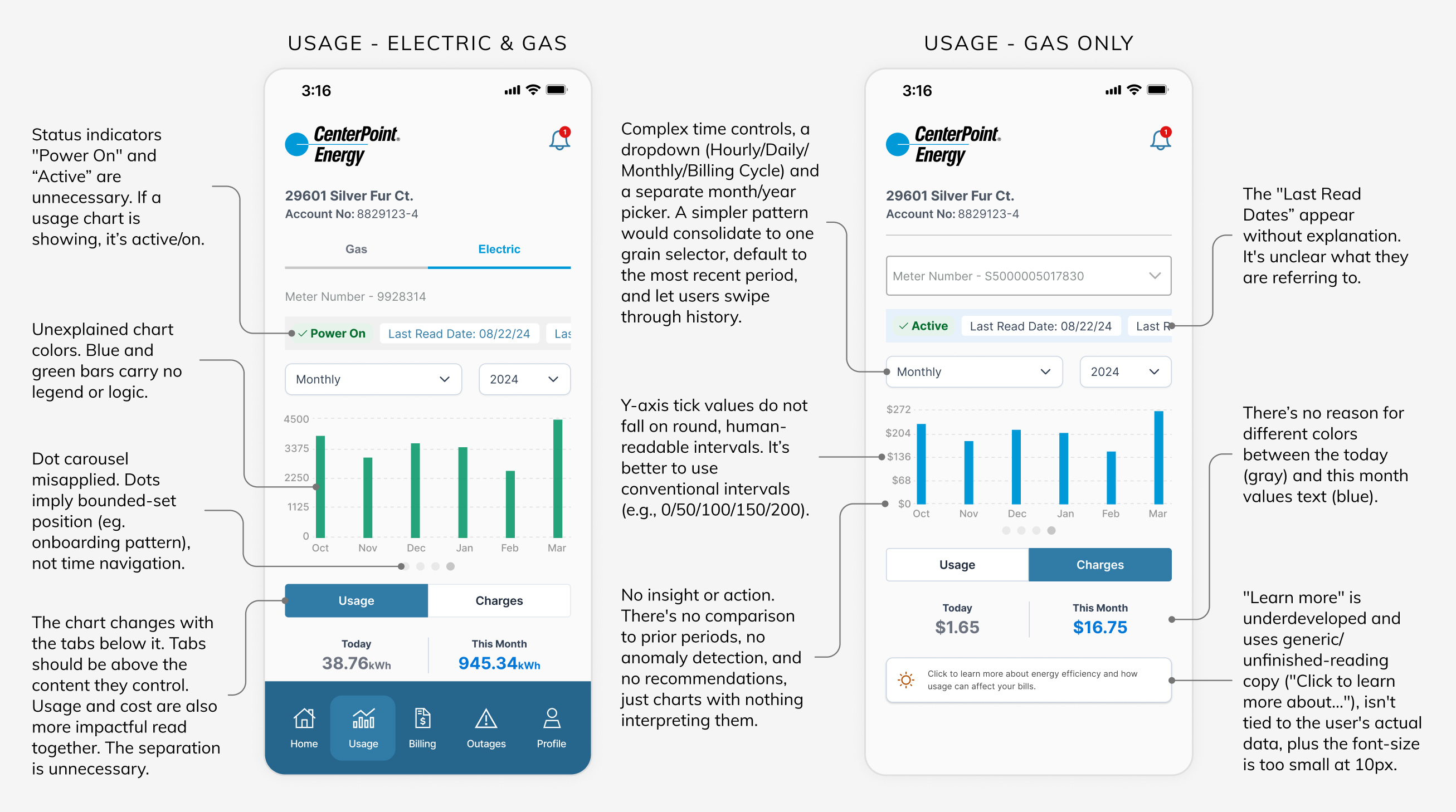
Screen space and content weren’t used efficiently. There was empty space that could have been put to better use, and content that belonged together was split across multiple screens instead. Some content was unclear, and usage data provided no proactive value or strong takeaways to tell users what they could do about it, leaving nothing actionable. Key flows also had unnecessary clicks and friction that could have been optimized. Overall, the app functioned as a passive data repository rather than a reliable, insight-driven assistant for managing energy usage and bills.

Goals

1. Help users manage their account and pay their bill with less friction.
2. Incentivize lower energy use by making consumption visible and understandable.
3. Increase engagement by helping users see what they’re using and why it matters.

The redesign needed to:

  • Turn the home screen into a real dashboard, not a single action with dead space below it.
  • Turn data into insight.
  • Provide clarity across every chart, control, and label.
  • Use space better, consolidating redundant screens, reducing dead space, and tightening content.
  • Make the app more actionable, surfacing things like reporting an outage or reducing usage, not just displaying numbers.
  • Simplify navigation and controls.

Discovery

Auditing the Current Experience

I audited several key, highly seen screens and used flows to find where the current product was lacking, including friction points, clarity and content issues, and opportunities for clearer content, more efficient flows, better use of space, and ways to entice engagement.

Ideation

Iterating on Screens

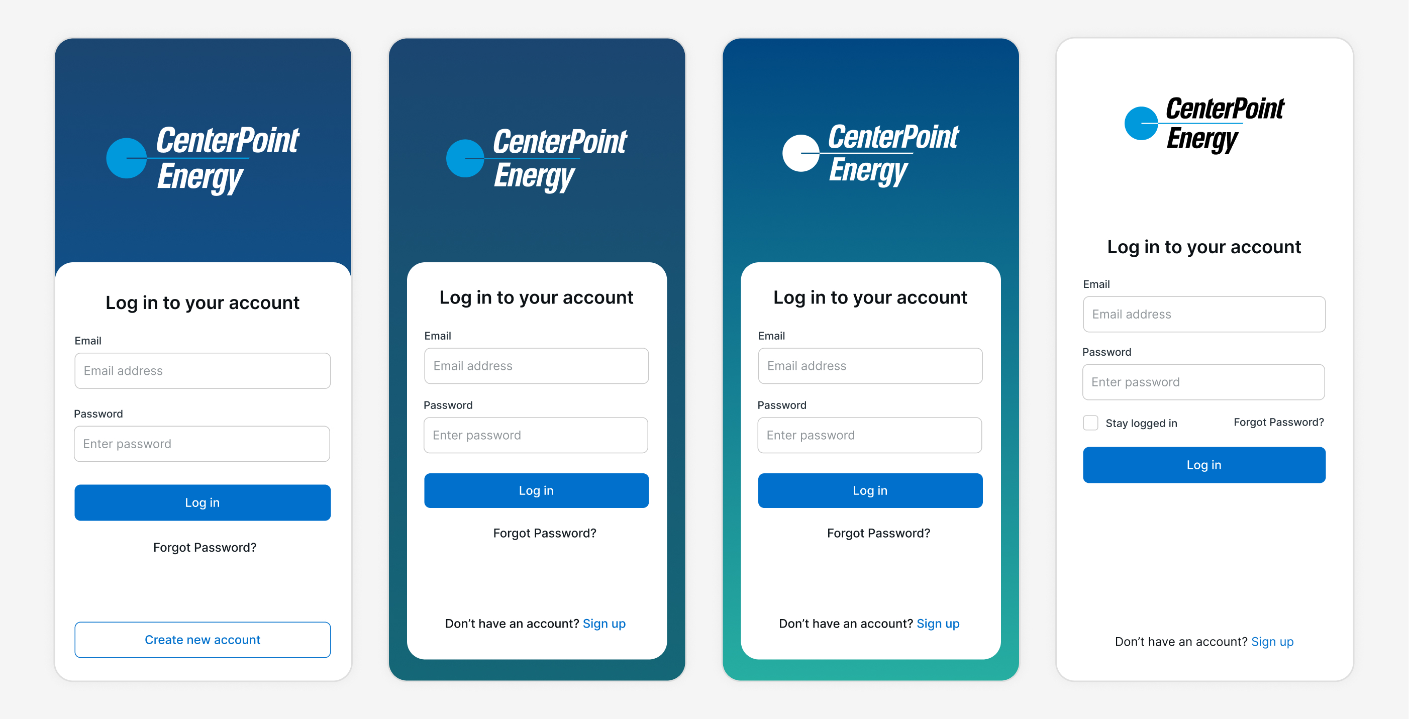
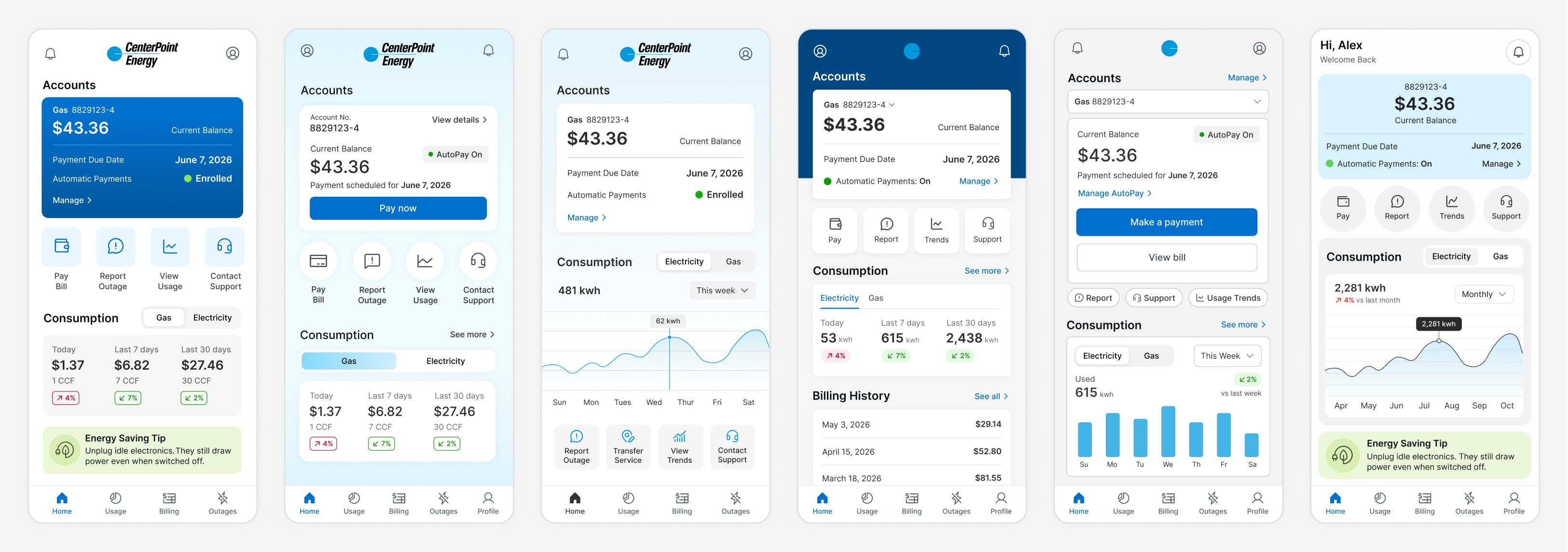
I created and iterated on several quick design concepts without fully refining them, exploring ways to incorporate the new brand styles, content options and positioning, layout, header styles, and the best ways to optimize key flows across various screens.

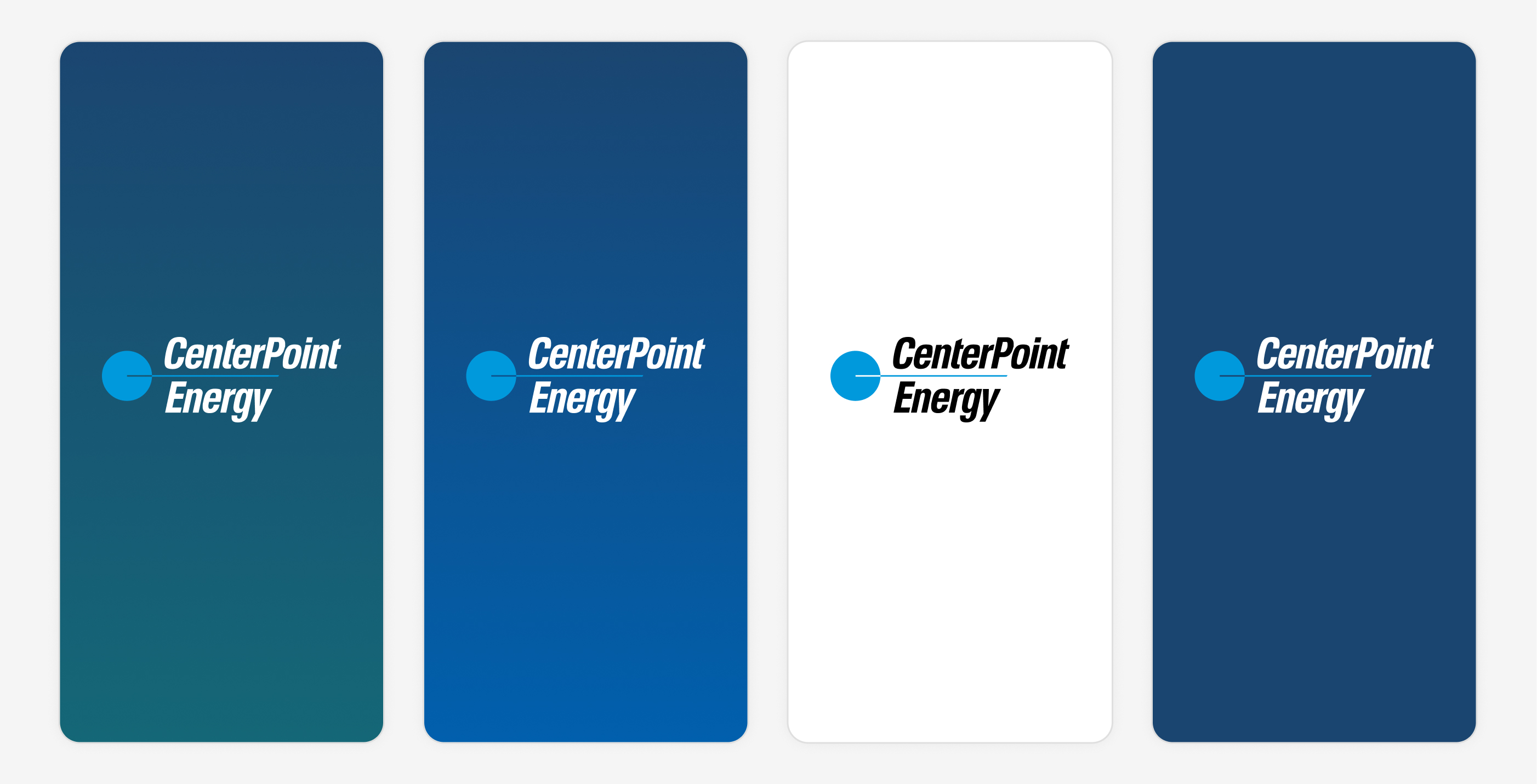
Splash Screen

Log In Screen

Home Screen

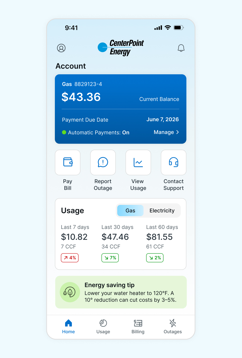
I created several iterations of the home screen because it had the most dead space and the primest real estate, so I wanted to make sure I was providing the most actionable content. I explored different content options and how to lay the information out to surface the top action items and the information most valuable to users, and encourage them to explore and use more of the app.

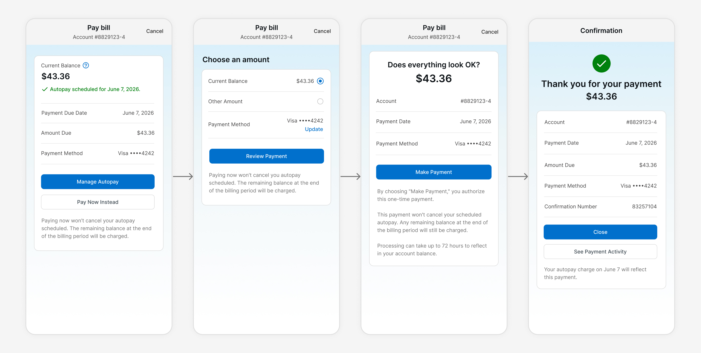
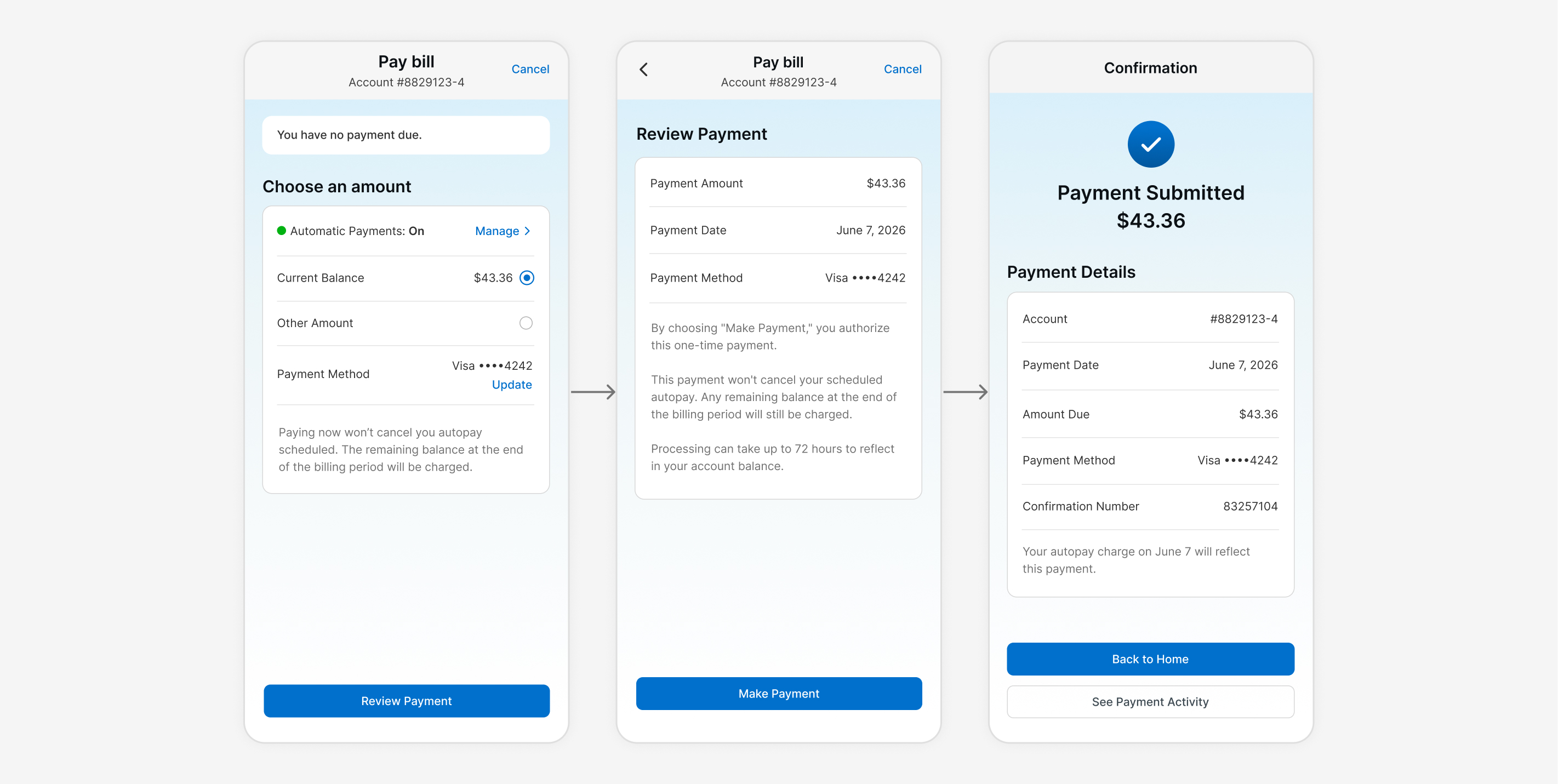
Payment Flows

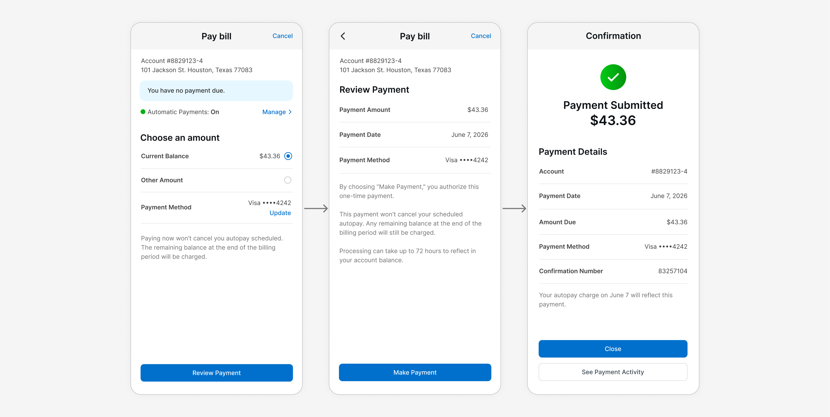
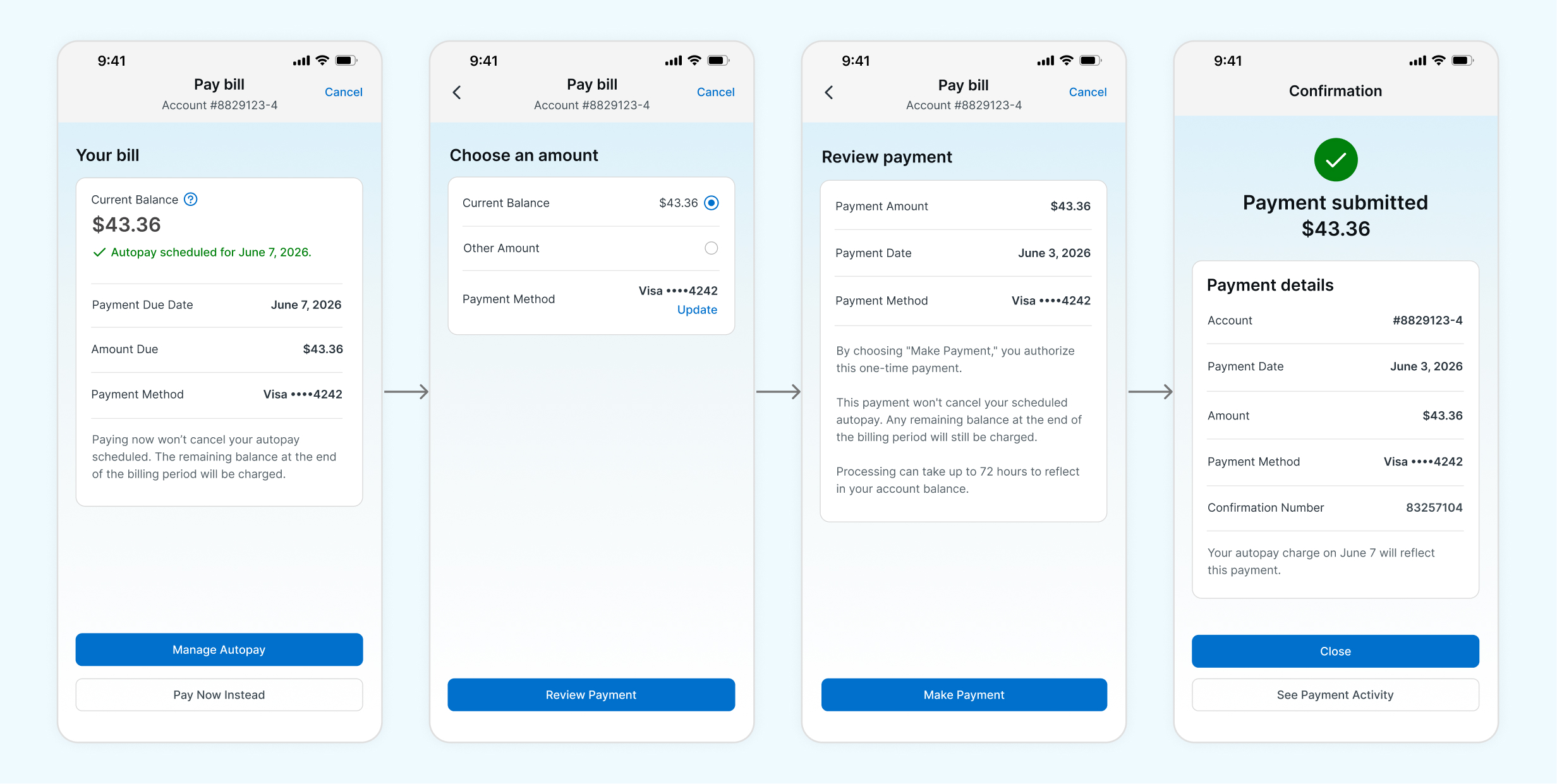
I created several screens and explored different flows for making a payment, including editing payment details, reviewing a payment, and confirmation. I based the payment flow iteration around a user with autopay set up, since a large majority of users have autopay enabled.

Usage Screen

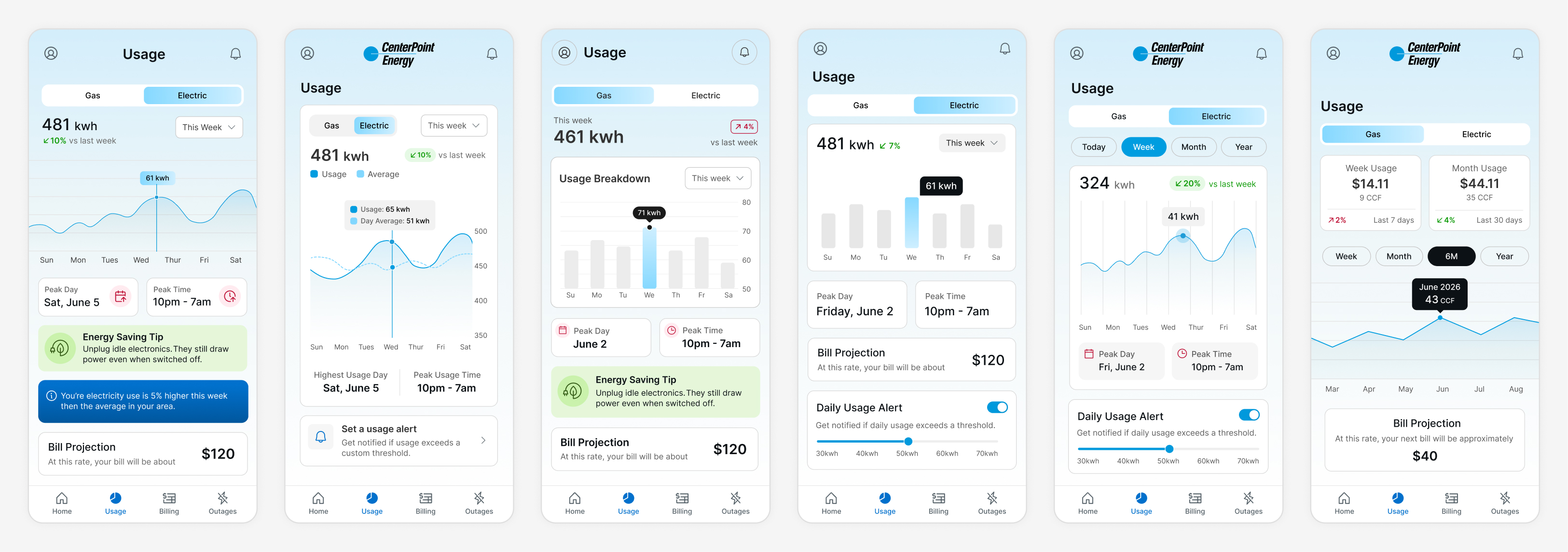
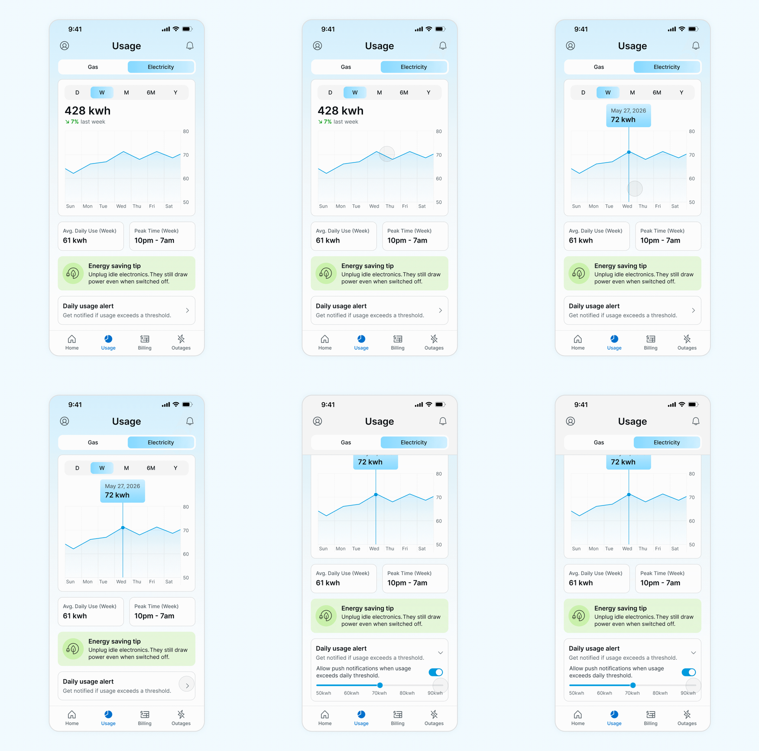
I explored various ways to display usage data through graphs and stat cards, and how that could be combined with timeframe selection. I also explored different usage data takeaways that could be presented to provide users with actionable value.

Refinement

Reviewing My Iterations

I reviewed my iterations multiple times to identify what was and wasn’t working and providing value, then I shared them with peers, who highlighted a few additional issues. I selected and refined a handful of iterations and prototyped them for user testing.

Validating with Users

I took the iterations through moderated usability testing to gather feedback and validate direction. Overall, users responded well to having valuable, proactive information surfaced to them. They wanted useful information they could engage with, an easy way to understand their usage, and the simplest possible path for paying bills and accessing past ones. Below are some of the key insights from testing.

Login

  • Face ID login would be very valuable.
  • Typing credentials every time felt tedious.

Home

  • Users preferred quick usage insights over a graph on this screen.
  • They also valued the energy savings tips and said they’d use that information to try to save.

Pay Bill

  • If autopay is already set up, users wanted the screen to prioritize managing autopay over paying.
  • Account number is better in the header so it doesn’t compete with the billing info.
  • Button placement at the bottom of the screen versus below the content tested best here, since it’s closest to a user’s thumb.
  • A green checkmark reads best as good and complete.

Usage Screen

  • An estimated next bill or bill projection wasn’t seen as valuable, since it didn’t tell users what to do about it.
  • The area insight tip didn’t feel proactive either.
  • Users preferred a line graph.
  • Users loved the ability to set up a daily usage alert.
  • Highest usage day and peak day were easy to read directly off the chart and didn’t need a separate call out or stat card.
  • Users preferred timeframe selection via chips over a dropdown, since it was easier to select.
  • Users liked being able to see the percentage change at a glance.

Refining the Usage Screen

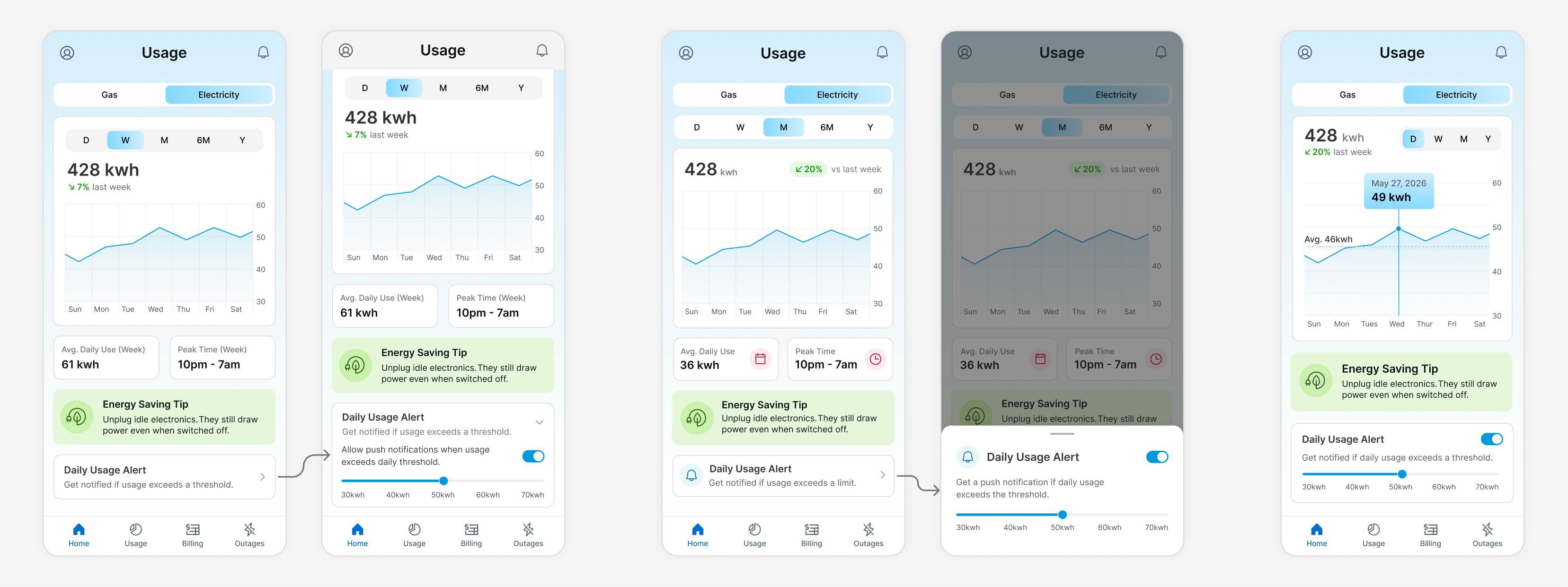
I utilized the feedback to refine the usage screen and work out a few additional functional details. I explored different approaches for the timeframe selector and for daily usage alert setup, including whether the alert should be shown or hidden by default and what the experience should look like if hidden. I also explored whether and how to surface average daily use and peak usage time.

Final Design

Effortless Sign In

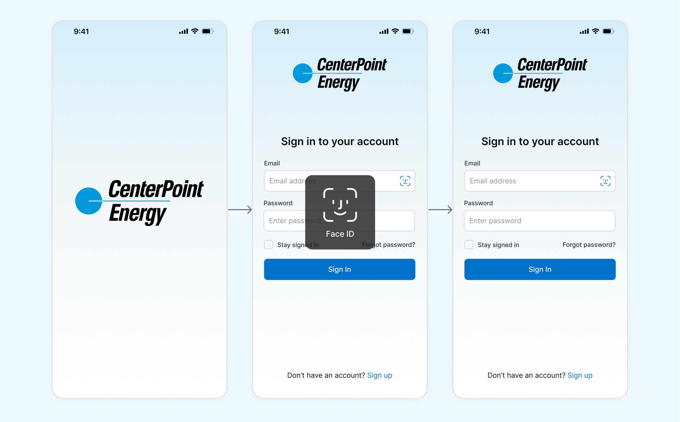
The splash screen, and the rest of the app, uses the light blue gradient widely featured in CenterPoint’s new branding as a background. It keeps the CenterPoint logo large and centered in its full color version, since that treatment carries the strongest brand recognition.

The login screen attempts Face ID from the start for returning users, the fastest and most effortless way to log in. If Face ID fails, a user opts out of it, or they’re a new user, a standard login screen appears instead.

Clearer Home, Usage, and Billing Experience

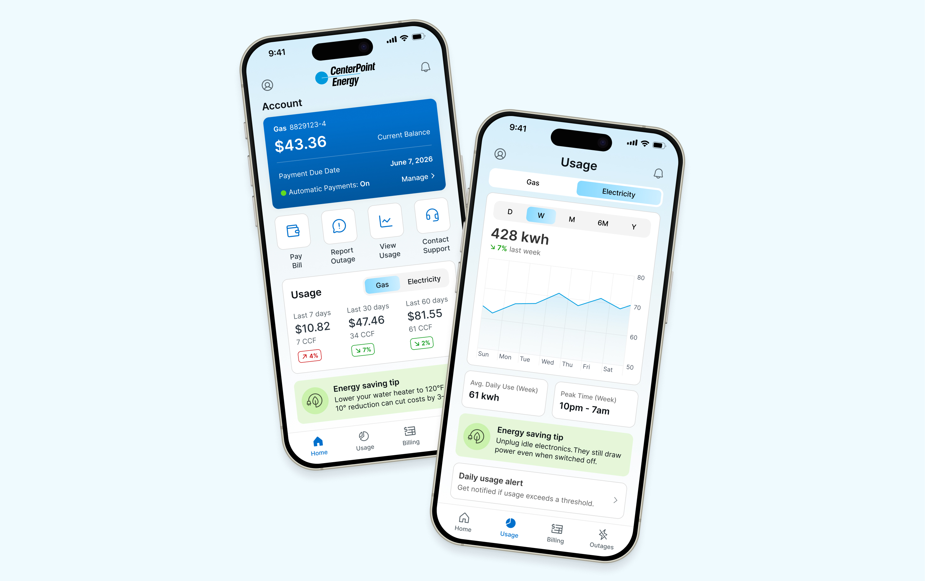
The home screen uses its prime real estate to present the most actionable items first, including account balance, due date, autopay status, and quick actions like paying a bill or reporting an outage. Below that, a usage snapshot shows spend and percentage change over time, paired with a personalized energy saving tip.

The usage screen offers a seamless, effortless way to view usage data alongside proactive insights and features that help users manage their energy more efficiently. Users can select gas or electric, choose a timeframe, and browse usage data within their selected criteria. The screen also surfaces their average daily use for context, a personalized tip based on their usage, and the ability to set a custom threshold and get notified when usage exceeds it.

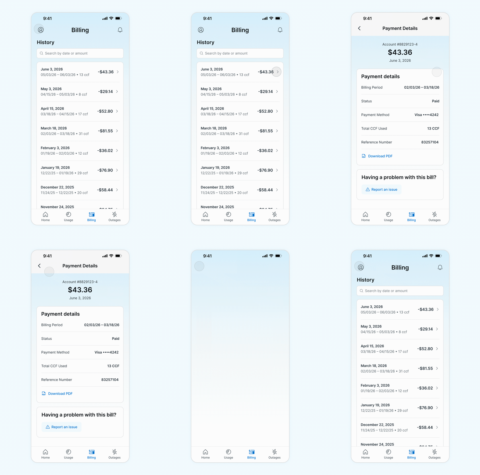
For billing, users can see all the critical information for each bill at a glance and search their billing history to find a specific one. Selecting a bill shows more detail, along with the ability to download the statement or report an issue.

Paying with Flexibility

Paying a bill on an account with autopay set up prioritizes managing autopay as the primary action, while still letting users choose to pay now instead. The pay now instead path takes the user through selecting an amount, choosing a payment method, reviewing the payment, and confirming it.

The Outcome

This redesign reworks CenterPoint’s app as an active, insight-driven assistant rather than a passive data repository. Once implemented, users will be able to understand their bill, manage payments, and make sense of their energy usage without doing the analytical work themselves. By simplifying navigation, reducing friction, and surfacing proactive, actionable insight throughout, the redesign supports CenterPoint’s goal of helping customers manage their accounts and make more informed decisions about their energy use.